
┬Ā
õ╗źõĖŗµś»ÕÅ»õ╗źńö©µØźõĖ║õĖŹÕÉīńÜäÕ▒ÅÕ╣ĢÕ░║Õ»ĖŃĆüÕāÅń┤ĀÕ»åÕ║”ÕÆīń║Ąµ©¬µ»öÕīģÕɽÕÅ»µø┐µŹóĶĄäµ║ÉńÜäµ¢ćõ╗ČÕż╣ÕÉŹń¦░ķÖÉÕ«Üń¼”
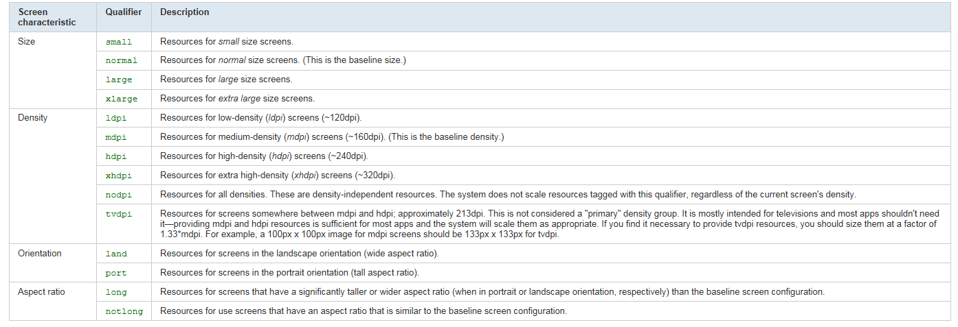
1ŃĆüÕ▒ÅÕ╣ĢÕ░║Õ»Ė┬Ā small Õ░Åõ║ĵĀćÕćåńÜä3.2ŌĆ£ńÜäÕ▒ÅÕ╣Ģ
┬Ā┬Ā┬Ā┬Ā┬Ā┬Ā┬Ā┬Ā┬Ā┬Ā┬Ā┬Ā┬Ā┬Ā┬Ā┬Ā┬Ā medium ÕģĖÕ×ŗńÜäµÖ║ĶāĮµēŗµ£║ńÜäÕ▒ÅÕ╣ĢÕ░║Õ»Ė
┬Ā┬Ā┬Ā┬Ā┬Ā┬Ā┬Ā┬Ā┬Ā┬Ā┬Ā┬Ā┬Ā┬Ā┬Ā┬Ā┬Ā large µ»öÕģĖÕ×ŗńÜäµÖ║ĶāĮµēŗµ£║ńÜäÕ▒ÅÕ╣ĢÕż¦ÕŠŚÕżÜńÜäÕ▒ÅÕ╣Ģ’╝īµ»öÕ”éÕ╣│µØ┐ńöĄĶäæÕÆīõĖŖńĮæµ£¼
2ŃĆüÕāÅń┤ĀÕ»åÕ║”┬Ā ÕāÅń┤ĀÕ»åÕ║”ķĆÜÕĖĖµś»ńö©µ»ÅĶŗ▒Õ»Ėńé╣µĢ░µØźĶ«Īń«Ś
┬Ā┬Ā┬Ā┬Ā┬Ā┬Ā┬Ā┬Ā┬Ā┬Ā┬Ā┬Ā┬Ā┬Ā┬Ā┬Ā┬Ā ldpi┬Ā ńö©õ║ÄõĖ║ÕāÅń┤ĀÕ»åÕ║”Õ£©100~140dpiõ╣ŗķŚ┤ńÜäÕ▒ÅÕ╣ĢÕŁśÕé©õĮÄÕ»åÕ║”ĶĄäµ║É
┬Ā┬Ā┬Ā┬Ā┬Ā┬Ā┬Ā┬Ā┬Ā┬Ā┬Ā┬Ā┬Ā┬Ā┬Ā┬Ā┬Ā mdpi ńö©õ║ÄÕāÅń┤ĀÕ»åÕ║”Õ£©140~180dipõ╣ŗķŚ┤ńÜäõĖŁńŁēÕ»åÕ║”ńÜäÕ▒ÅÕ╣Ģ
┬Ā┬Ā┬Ā┬Ā┬Ā┬Ā┬Ā┬Ā┬Ā┬Ā┬Ā┬Ā┬Ā┬Ā┬Ā┬Ā┬Ā hdpi ńö©õ║ÄÕāÅń┤ĀÕ»åÕ║”Õ£©190~250dipõ╣ŗķŚ┤ńÜäķ½śÕ»åÕ║”ńÜäÕ▒ÅÕ╣Ģ
┬Ā┬Ā┬Ā┬Ā┬Ā┬Ā┬Ā┬Ā┬Ā┬Ā┬Ā┬Ā┬Ā┬Ā┬Ā┬Ā┬Ā nodpi ńö©õ║ÄõĖŹń«ĪÕ▒ÅÕ╣ĢÕ»åÕ║”Õ”éõĮĢ’╝īķāĮõĖŹĶāĮõ╝Ėń╝®ńÜäĶĄäµ║É
3ŃĆüń║Ąµ©¬µ»ö┬Ā┬ĀÕ▒ÅÕ╣ĢńÜäń║Ąµ©¬µ»öÕ░▒µś»ÕģČķ½śÕ║”ÕÆīÕ«ĮÕ║”ńÜäµ»öńÄć
┬Ā┬Ā┬Ā┬Ā┬Ā┬Ā┬Ā┬Ā┬Ā┬Ā┬Ā┬Ā┬Ā┬Ā┬Ā┬Ā long ńö©õ║ĵ©¬ÕÉ浩ĪÕ╝ÅńÜäÕ«ĮÕ║”µ»öµĀćÕćåµÖ║ĶāĮµēŗµ£║(Õ”éG1)ńÜäÕ«ĮÕ║”Õż¦ÕŠŚÕżÜńÜäÕ▒ÅÕ╣Ģ
┬Ā┬Ā┬Ā┬Ā┬Ā┬Ā┬Ā┬Ā┬Ā┬Ā┬Ā┬Ā┬Ā┬Ā┬Ā┬Ā┬Ānotlong ńö©õ║ÄÕģʵ£ēÕģĖÕ×ŗµÖ║ĶāĮµēŗµ£║ńÜäń║Ąµ©¬µ»öńÜäÕ▒ÅÕ╣Ģ
ÕģĘõĮōµÅÅĶ┐░Õ”éõĖŗĶĪ©µĀ╝’╝Ü
┬Ā
µ»ÅõĖ¬ķÖÉÕ«Üń¼”ÕÅ»õ╗źÕŹĢńŗ¼õĮ┐ńö©õ╣¤ÕÅ»õ╗źÕÆīÕģČõ╗¢ķÖÉÕ«Üń¼”õĖĆĶĄĘõĮ┐ńö©
Õ”é res/layout-small-long┬Ā┬Ā //Õ░ÅĶĆīķĢ┐ńÜäÕ▒ÅÕ╣ĢńÜäÕĖāÕ▒Ć
┬Ā┬Ā ┬Āres/layout-large┬Ā┬Ā┬Ā┬Ā┬Ā┬Ā┬Ā┬Ā┬Ā┬Ā┬Ā //Õż¦Õ▒ÅÕ╣ĢńÜäÕĖāÕ▒Ć
┬Ā┬Ā┬Ā res/drawable-hdpi┬Ā┬Ā┬Ā┬Ā┬Ā┬Ā┬Ā┬Ā //ķ½śÕ»åÕ║”Õ▒ÅÕ╣ĢńÜä Drawable┬Ā
┬Ā┬Ā┬Ā res/layout/my_layout.xml┬Ā┬Ā┬Ā┬Ā┬Ā┬Ā┬Ā┬Ā┬Ā┬Ā┬Ā┬Ā┬Ā// layout for normal screen size ("default")
┬Ā┬Ā┬Ā res/layout-small/my_layout.xml┬Ā┬Ā┬Ā┬Ā┬Ā┬Ā┬Ā// layout for small screen size
┬Ā┬Ā┬Ā res/layout-large/my_layout.xml┬Ā┬Ā┬Ā┬Ā┬Ā┬Ā┬Ā// layout for large screen size
┬Ā┬Ā┬Ā res/layout-xlarge/my_layout.xml┬Ā┬Ā┬Ā┬Ā┬Ā┬Ā// layout for extra large screen size
┬Ā┬Ā┬Ā res/layout-xlarge-land/my_layout.xml┬Ā// layout for extra large in landscape orientation
┬Ā┬Ā┬Ā res/drawable-mdpi/my_icon.png┬Ā┬Ā┬Ā┬Ā┬Ā┬Ā┬Ā┬Ā// bitmap for medium density
┬Ā┬Ā┬Ā res/drawable-hdpi/my_icon.png┬Ā┬Ā┬Ā┬Ā┬Ā┬Ā┬Ā┬Ā// bitmap for high density
┬Ā┬Ā┬Ā res/drawable-xhdpi/my_icon.png┬Ā┬Ā┬Ā┬Ā┬Ā┬Ā┬Ā// bitmap for extra high density
┬ĀTip:┬ĀIf you have some drawable resources that the system should never scale (perhaps because you perform some adjustments to the image yourself at runtime), you should place them in a directory with the┬Ānodpi┬Āconfiguration qualifier. Resources with this qualifier are considered density-agnostic and the system will not scale them.
ķÖä’╝ÜķĆÜĶ┐ć<supports-screens android:smallScreens="false" android:normalScreens="true" android:largeScreens="true" android:anyDensity="true"/>µĖģÕŹĢÕÅ»õ╗źµÄ¦ÕłČµīćÕ«ÜÕ║öńö©ń©ŗÕ║ÅÕ£©Õō¬õ║øÕ▒ÅÕ╣ĢõĖŗĶ┐ÉĶĪī
┬Ā
Declaring Tablet Layouts for Android 3.2
┬Ā
┬Ā
|
smallestWidth’╝łÕ«ĮÕÆīķ½śõĖŁµ»öĶŠāÕ░Å ńÜäķĢ┐Õ║”Ķ”üµ»ö<N>Õż¦’╝ē |
sw<N>dpExamples: sw600dpsw720dp
|
The fundamental size of a screen, as indicated by the shortest dimension of the available screen area. Specifically, the device's smallestWidth is the shortest of the screen's available height and width (you may also think of it as the "smallest possible width" for the screen). You can use this qualifier to ensure that, regardless of the screen's current orientation, your application's has at least┬Ā For example, if your layout requires that its smallest dimension of screen area be at least 600 dp at all times, then you can use this qualifer to create the layout resources,┬Ā The smallestWidth of a device takes into account screen decorations and system UI. For example, if the device has some persistent UI elements on the screen that account for space along the axis of the smallestWidth, the system declares the smallestWidth to be smaller than the actual screen size, because those are screen pixels not available for your UI. This is an alternative to the generalized screen size qualifiers (small, normal, large, xlarge) that allows you to define a discrete number for the effective size available for your UI. Using smallestWidth to determine the general screen size is useful because width is often the driving factor in designing a layout. A UI will often scroll vertically, but have fairly hard constraints on the minimum space it needs horizontally. The available width is also the key factor in determining whether to use a one-pane layout for handsets or multi-pane layout for tablets. Thus, you likely care most about what the smallest possible width will be on each device. |
|
Available screen width ’╝łÕ«ĮÕ║”Ķć│Õ░æĶ”üµ»ö<N>Õż¦’╝ē |
w<N>dpExamples: w720dpw1024dp
|
Specifies a minimum available width in dp units at which the resources should be usedŌĆödefined by the┬Ā This is often useful to determine whether to use a multi-pane layout, because even on a tablet device, you often won't want the same multi-pane layout for portrait orientation as you do for landscape. Thus, you can use this to specify the minimum width required for the layout, instead of using both the screen size and orientation qualifiers together. |
|
Available screen height ┬Ā ’╝łķ½śÕ║”Ķć│Õ░æĶ”üµ»ö<N>Õż¦’╝ē ┬Ā |
h<N>dpExamples: h720dph1024dpetc. |
Specifies a minimum screen height in dp units at which the resources should be usedŌĆödefined by the┬Ā Using this to define the height required by your layout is useful in the same way as┬Ā |
┬Ā
To help you target some of your designs for different types of devices, here are some numbers for typical screen widths:
- 320dp: a typical phone screen (240x320 ldpi, 320x480 mdpi, 480x800 hdpi, etc).
- 480dp: a tweener tablet like the Streak (480x800 mdpi).
- 600dp: a 7ŌĆØ tablet (600x1024 mdpi).
- 720dp: a 10ŌĆØ tablet (720x1280 mdpi, 800x1280 mdpi, etc).
┬ĀCaution:┬ĀWhen developing for Android 3.2 and higher, you should not use the older screen size attributes in combination with the attributes listed above. Using both the new attributes and the older size attributes might cause unexpected behavior.


ńøĖÕģ│µÄ©ĶŹÉ
Androidń│╗ń╗¤õ╝ܵĀ╣µŹ«Ķ«ŠÕżćńÜäÕ▒ÅÕ╣ĢÕ░║Õ»ĖÕÆīÕ»åÕ║”µØźķĆēµŗ®ÕÉłķĆéńÜäĶĄäµ║ÉŃĆéĶ┐Öõ║øĶĄäµ║ÉĶó½ń╗äń╗ćÕ£©õĖŹÕÉīńÜäµ¢ćõ╗ČÕż╣õĖŗ’╝īõŠŗÕ”é`values`, `drawables`, `layout`ńŁēŃĆéÕ»╣õ║ÄÕ▒ÅÕ╣ĢķĆéķģŹ’╝īµłæõ╗¼Õģ│µ│©ńÜ䵜»`layout`µ¢ćõ╗ČÕż╣õĖŗńÜäÕ«Įķ½śķÖÉÕ«Üń¼”ŃĆé Õ«Įķ½śķÖÉÕ«Üń¼”µś»...
µŁżÕż¢’╝īAndroidĶ┐śµÅÉõŠøõ║åŌĆ£nodpiŌĆØŃĆüŌĆ£hdpiŌĆØŃĆüŌĆ£xhdpiŌĆØŃĆüŌĆ£xxhdpiŌĆØÕÆīŌĆ£xxxhdpiŌĆØńŁēÕ»åÕ║”ķÖÉÕ«Üń¼”’╝īńö©õ║ÄÕøŠńēćÕÆīÕģČõ╗¢ķØ×ÕĖāÕ▒ĆĶĄäµ║ÉńÜäķĆéķģŹŃĆéĶ┐Öõ║øÕ»åÕ║”µĪČńĪ«õ┐Øõ║åÕ£©õĖŹÕÉīÕāÅń┤ĀÕ»åÕ║”ńÜäÕ▒ÅÕ╣ĢõĖŖ’╝īĶĄäµ║ÉńÜäĶ¦åĶ¦ēÕż¦Õ░Åõ┐صīüõĖĆĶć┤ŃĆéÕ╝ĆÕÅæĶĆģÕ║öĶ»źµÅÉõŠø...
UI ķĆéķģŹõĖ╗Ķ”üÕÅŚÕ╣│ÕÅ░õĖżõĖ¬ÕøĀń┤ĀńÜäÕĮ▒ÕōŹ’╝ÜÕ▒ÅÕ╣ĢÕ░║Õ»Ė’╝łÕ▒ÅÕ╣ĢńÜäÕāÅń┤ĀÕ«ĮÕ║”ÕÅŖÕāÅń┤Āķ½śÕ║”’╝ēÕÆīÕ▒ÅÕ╣ĢÕ»åÕ║”ŃĆé Õ£© Android õĖŁ’╝īÕ▒ÅÕ╣ĢÕ░║Õ»ĖÕÅ»õ╗źÕłåõĖ║ small, normal, large, xlarge ńŁēSeveral Õłåń▒╗’╝īµ»Åń¦ŹÕłåń▒╗ķāĮÕ»╣Õ║öńØĆńē╣Õ«ÜńÜäÕ▒ÅÕ╣ĢÕ░║Õ»ĖĶīāÕø┤ŃĆéÕ▒ÅÕ╣Ģ...
µ£¼µ¢ćÕ░åµĘ▒ÕģźµÄóĶ«©Õ”éõĮĢÕł®ńö©AndroidńÜäÕĘźÕģĘÕÆīĶĄäµ║ÉµØźÕ«×ńÄ░ķ½śµĢłńÜäÕżÜÕ▒ÅÕ╣ĢķĆéķģŹŃĆé ķ”¢Õģł’╝īµłæõ╗¼µØźń£ŗµĀćķóśõĖŁńÜäŌĆ£pxŌĆØ’╝īĶ┐ÖµīćńÜ䵜»ÕāÅń┤Ā’╝łPixel’╝ē’╝īµś»Õ▒ÅÕ╣ĢõĖŖńÜäµ£ĆÕ░ŵśŠńż║ÕŹĢÕģāŃĆéÕ£©AndroidõĖŁ’╝īÕāÅń┤ĀÕ╣ČõĖŹńø┤µÄźÕ»╣Õ║öõ║ÄÕ▒ÅÕ╣ĢńÜäÕ«×ķÖģÕż¦Õ░Å’╝īÕøĀõĖ║õĖŹÕÉī...
Õ╝ĆÕÅæĶĆģĶ┐śÕÅ»õ╗źķĆÜĶ┐ćµĘ╗ÕŖĀńē╣Õ«ÜńÜäqualifier’╝łķÖÉÕ«Üń¼”’╝ēµØźõĖ║õĖŹÕÉīÕ▒ÅÕ╣ĢÕ░║Õ»Ėµł¢µ¢╣ÕÉæµÅÉõŠøÕ«ÜÕłČńÜäÕĖāÕ▒ĆŃĆéõŠŗÕ”é’╝īres/layout-sw600dpńö©õ║Ä7Ķŗ▒Õ»ĖÕÅŖõ╗źõĖŖÕ╣│µØ┐Ķ«ŠÕżć’╝īres/layout-landńö©õ║ĵ©¬Õ▒ŵ©ĪÕ╝ÅŃĆé 8. Density-independent Pixels’╝łdp’╝ē...
AndroidµÅÉõŠøõ║åÕżÜń¦ŹÕĖāÕ▒ĆÕÆīĶ«ŠĶ«ĪńŁ¢ńĢźµØźķĆéÕ║öõĖŹÕÉīÕ░║Õ»ĖńÜäÕ▒ÅÕ╣Ģ’╝īÕ”éõĮ┐ńö©`sw600dp`ŃĆü`w600dp`Ķ┐ÖµĀĘńÜäķÖÉÕ«Üń¼”ÕłøÕ╗║õĖŹÕÉīńÜäĶĄäµ║ɵ¢ćõ╗ČÕż╣’╝īµł¢ĶĆģõĮ┐ńö©ńÖŠÕłåµ»öÕĖāÕ▒ĆŃĆüń║”µØ¤ÕĖāÕ▒ĆńŁēĶć¬ķĆéÕ║öÕĖāÕ▒ƵŖƵ£»ŃĆé 6. **Õ«×ĶĘĄõĖĵĄŗĶ»Ģ**’╝Ü Õ£©Õ«×ķÖģÕ╝ĆÕÅæõĖŁ’╝īõĖ║õ║å...
Android ńĢīķØóķĆéķģŹµ£║ÕłČ’╝īÕŹ│Õ£©ĶĄäµ║ÉÕÉÄķØóµĘ╗ÕŖĀÕ»╣Õ▒ÅÕ╣ĢÕ░║Õ»ĖÕÆīÕ▒ÅÕ╣ĢÕ»åÕ║”ńÜäķÖÉÕ«Ü’╝īķĆÜĶ┐ćõĖŹÕÉīńÜäķÖÉÕ«ÜÕī║ÕłåõĖŹÕÉīńÜäÕ╣│ÕÅ░ĶĄäµ║É’╝īAndroid Õ£©õĮ┐ńö©ĶĄäµ║ÉńÜ䵌ČÕĆÖõ╝Üõ╝śÕģłķĆēµŗ®µ╗ĪĶČ│µ£¼Õ╣│ÕÅ░ķÖÉÕ«ÜńÜäĶĄäµ║É’╝īÕåŹµēŠµ£ĆµÄźĶ┐æµØĪõ╗ČńÜä’╝īÕåŹµēŠķ╗śĶ«ż’╝łÕŹ│õĖŹÕŖĀķÖÉÕ«Ü’╝ē’╝ī...
õĖ║õ║åÕ«×ńÄ░µø┤ń▓Šń╗åÕī¢ńÜäķĆéķģŹ’╝īAndroidĶ┐śÕ╝ĢÕģźõ║åswXXdp’╝łµ£ĆÕ░ÅÕ«ĮÕ║”’╝ēÕÆīwXXdp’╝łÕ«ĮÕ║”’╝ēĶ┐ÖµĀĘńÜäń╗┤Õ║”ķÖÉÕ«Üń¼”’╝īõŠŗÕ”é`values-sw320dp`õ╝ÜķÆłÕ»╣µ£ĆÕ░ÅÕ«ĮÕ║”õĖ║320dpńÜäĶ«ŠÕżćµÅÉõŠøĶĄäµ║ÉŃĆéĶ┐ÖµĀĘ’╝īÕ╝ĆÕÅæĶĆģÕÅ»õ╗źµĀ╣µŹ«Ķ«ŠÕżćńÜäÕ«×ķÖģÕÅ»ńö©Õ«ĮÕ║”µØźĶ░āµĢ┤ÕĖāÕ▒Ć’╝īĶĆī...
6. **õĮ┐ńö©ķÖÉÕ«Üń¼”**’╝ÜÕ£©ĶĄäµ║Éńø«ÕĮĢõĖŁ’╝īÕÅ»õ╗źõĮ┐ńö©widthŃĆüheightŃĆüswXXdpńŁēķÖÉÕ«Üń¼”µØźµø┤ń▓ŠńĪ«Õ£░µÄ¦ÕłČÕĖāÕ▒ĆĶĄäµ║ÉńÜäõĮ┐ńö©’╝īõŠŗÕ”é’╝īres/layout-sw600dp/ńö©õ║Ä7Ķŗ▒Õ»ĖÕÅŖõ╗źõĖŖÕ╣│µØ┐Ķ«ŠÕżćŃĆé 7. **õĮ┐ńö©ńóÄńēć’╝łFragment’╝ē**’╝ÜńóÄńēćÕÅ»õ╗źńŗ¼ń½ŗõ║Ä...
Õ£©AndroidÕ╝ĆÕÅæõĖŁ’╝īÕ▒ÅÕ╣ĢķĆéķģŹµś»õĖĆķĪ╣Ķć│Õģ│ķćŹĶ”üńÜäõ╗╗ÕŖĪ’╝īÕøĀõĖ║AndroidĶ«ŠÕżćµŗźµ£ēÕ╣┐µ│øńÜäÕ▒ÅÕ╣ĢÕ░║Õ»ĖÕÆīÕāÅń┤ĀÕ»åÕ║”ŃĆéõ╗źõĖŗµś»Õģ│õ║ÄAndroidÕ▒ÅÕ╣ĢķĆéķģŹńÜäĶ»”ń╗åń¤źĶ»åńé╣’╝Ü 1. **Õ▒ÅÕ╣ĢńøĖÕģ│µ”éÕ┐Ą** - **Ķ¦Żµ×ÉÕ║”**’╝ܵīćńÜ䵜»Õ▒ÅÕ╣Ģµ░┤Õ╣│ÕÆīÕ×éńø┤µ¢╣ÕÉæõĖŖńÜäÕāÅń┤Ā...
7. **swXXdpÕÆīwXXdpÕ░║Õ»ĖķÖÉÕ«Üń¼”**’╝ÜĶ┐Öõ║øķÖÉÕ«Üń¼”ńö©õ║ÄÕ«Üõ╣ēķÆłÕ»╣µ£ĆÕ░ÅÕ«ĮÕ║”’╝łsw’╝ēµł¢Õ«ĮÕ║”’╝łw’╝ēńÜäÕĖāÕ▒ĆŃĆéõŠŗÕ”é’╝ī`layout-sw600dp`õ╝ÜõĖ║Õ▒ÅÕ╣ĢÕ«ĮÕ║”Ķć│Õ░æõĖ║600dpńÜäĶ«ŠÕżćµÅÉõŠøńē╣Õ«ÜńÜäÕĖāÕ▒ĆŃĆé 8. **õĮ┐ńö©µĀģµĀ╝ń│╗ń╗¤**’╝ÜÕƤķē┤ńĮæķĪĄĶ«ŠĶ«ĪõĖŁńÜäµĀģµĀ╝...
1. **Õ▒ÅÕ╣ĢÕ░║Õ»ĖÕÆīÕ»åÕ║”**’╝ÜAndroidń│╗ń╗¤Õ░åÕ▒ÅÕ╣ĢÕłåõĖ║Õ░ÅŃĆüõĖŁŃĆüÕż¦ŃĆüĶČģÕż¦Õøøń¦ŹÕ░║Õ»Ė’╝īÕ╣ȵĀ╣µŹ«ÕāÅń┤ĀÕ»åÕ║”’╝łdpi’╝ēÕ░åÕģČÕłåõĖ║õĮÄŃĆüõĖŁŃĆüķ½śŃĆüĶČģķ½śÕ»åÕ║”ŃĆéÕ╝ĆÕÅæĶĆģķ£ĆĶ”üõĖ║õĖŹÕÉīÕ░║Õ»ĖÕÆīÕ»åÕ║”ńÜäÕ▒ÅÕ╣ĢµÅÉõŠøńøĖÕ║öńÜäĶĄäµ║ÉŃĆé 2. **ÕĖāÕ▒ĆĶĄäµ║É**’╝ÜõĮ┐ńö©õĖŹÕÉīńÜä...
Androidń│╗ń╗¤µö»µīüÕ╝ĆÕÅæĶĆģõĖ║õĖŹÕÉīÕ▒ÅÕ╣ĢÕ░║Õ»ĖÕÆīÕ»åÕ║”ÕłøÕ╗║ńē╣Õ«ÜńÜäÕĖāÕ▒ĆĶĄäµ║ɵ¢ćõ╗ČŃĆéĶ┐Öµś»Õ«×ńÄ░Ķć¬ķĆéÕ║öĶ«ŠĶ«ĪńÜäÕģ│ķö«õĖƵŁźŃĆéõŠŗÕ”é’╝īÕĮōÕ╝ĆÕÅæĶĆģÕłøÕ╗║õĖĆõĖ¬ÕÉŹõĖ║`layout-800x480`ńÜäńø«ÕĮĢµŚČ’╝īµäÅÕæ│ńØĆĶ»źńø«ÕĮĢõĖŗńÜäÕĖāÕ▒Ƶ¢ćõ╗ȵś»õĖōķŚ©õĖ║Õ«ĮÕ║”õĖ║800dpŃĆüķ½śÕ║”õĖ║...
Ķ┐ÖõĖ¬ń©ŗÕ║ÅÕĖ«ÕŖ®Õ╝ĆÕÅæĶĆģµø┤µ£ēµĢłÕ£░ń«ĪńÉåõĖÄÕ▒ÅÕ╣ĢÕ░║Õ»ĖńøĖÕģ│ńÜäÕĖāÕ▒ĆÕÆīÕ░║Õ»ĖĶĄäµ║É’╝īõ╗ÄĶĆīÕ«×ńÄ░µø┤ÕŖĀń▓Šń╗åÕī¢ńÜäÕ▒ÅÕ╣ĢķĆéķģŹŃĆé ķ”¢Õģł’╝īµłæõ╗¼µØźńÉåĶ¦ŻõĖĆõĖŗŌĆ£swŌĆØķÖÉÕ«Üń¼”ŃĆéÕ£©AndroidńÜäĶĄäµ║Éńø«ÕĮĢń╗ōµ×äõĖŁ’╝īŌĆ£swŌĆصś»ŌĆ£screen widthŌĆØńÜäń╝®ÕåÖ’╝īńö©õ║ĵīćÕ«ÜĶ«ŠÕżć...
2. ÕłåÕł½õĖ║õĖŹÕÉīÕ▒ÅÕ╣ĢÕ░║Õ»ĖÕÆīÕ»åÕ║”ÕłøÕ╗║ĶĄäµ║ɵ¢ćõ╗ČÕż╣’╝īÕ”é`values-mdpi`ŃĆü`values-hdpi`ŃĆü`values-xhdpi`ńŁē’╝īńäČÕÉÄÕ£©Õ»╣Õ║öńÜä`dimens.xml`õĖŁÕ«Üõ╣ēńøĖÕ║öńÜäÕ░║Õ»ĖŃĆé 3. ķüĄÕŠ¬AndroidńÜäŌĆ£µ£ĆÕ░ÅÕ«ĮÕ║”ŌĆØ’╝łsw<N>dp’╝ēÕĖāÕ▒ĆńŁ¢ńĢź’╝īõĖ║õĖŹÕÉīÕ▒ÅÕ╣ĢÕ«ĮÕ║”...
AndroidÕģüĶ«ĖÕ£©ĶĄäµ║Éńø«ÕĮĢõĖŁµĘ╗ÕŖĀÕ»åÕ║”ķÖÉÕ«Üń¼”’╝łÕ”éhdpi, xhdpi, xxhdpińŁē’╝ē’╝īõ╗źõŠ┐õĖ║õĖŹÕÉīÕ»åÕ║”ńÜäÕ▒ÅÕ╣ĢµÅÉõŠøķĆéķģŹńÜäÕøŠńēćŃĆéń│╗ń╗¤õ╝ÜĶć¬ÕŖ©ķĆēµŗ®µ£ĆµÄźĶ┐æÕĮōÕēŹĶ«ŠÕżćÕ»åÕ║”ńÜäĶĄäµ║É’╝īõ┐ØĶ»üÕøŠńē浜Šńż║µĖģµÖ░ŃĆé 6. Õ▒ÅÕ╣ĢķĆéķģŹńÜäµ£ĆõĮ│Õ«×ĶĘĄ’╝Ü - õĮ┐ńö©ńøĖÕ»╣ÕĖāÕ▒Ć...
- Õ«Įķ½śķÖÉÕ«Üń¼”ķĆéķģŹ’╝ÜÕł®ńö©swdp’╝łsmallest width’╝ēķÖÉÕ«Üń¼”õĖ║õĖŹÕÉīÕ▒ÅÕ╣ĢÕ░║Õ»ĖµÅÉõŠøĶĄäµ║ÉŃĆé - UI ķĆéķģŹµĪåµ×Č’╝ÜÕ”éFacebookńÜäFrescoŃĆüGoogleńÜäPercentSupportÕ║ōńŁē’╝īń«ĆÕī¢ķĆéķģŹÕĘźõĮ£ŃĆé - smallestWidth ķĆéķģŹ’╝ÜÕ¤║õ║ĵ£ĆÕ░ÅÕ«ĮÕ║”Ķ┐øĶĪīÕĖāÕ▒Ć...
õĖ║õ║åÕ«×ńÄ░ÕżÜÕłåĶŠ©ńÄćķĆéķģŹ’╝īÕ╝ĆÕÅæĶĆģķ£ĆĶ”üõĖ║õĖŹÕÉīÕ▒ÅÕ╣ĢÕ░║Õ»ĖÕÆīÕ»åÕ║”ÕłøÕ╗║ńøĖÕ║öńÜäĶĄäµ║ɵ¢ćõ╗ČÕż╣ŃĆéõŠŗÕ”é’╝īÕ░åÕøŠńēćŃĆüÕĖāÕ▒Ƶ¢ćõ╗ČńŁēµöŠÕ£©res/drawable-mdpiŃĆüres/drawable-hdpiŃĆüres/layout-smallńŁēńø«ÕĮĢõĖŗŃĆéAndroidń│╗ń╗¤õ╝ÜĶć¬ÕŖ©ķĆēµŗ®µ£ĆÕÉłķĆéńÜäĶĄäµ║É...
AndroidÕģüĶ«ĖÕ╝ĆÕÅæĶĆģõĖ║õĖŹÕÉīÕ▒ÅÕ╣ĢÕ░║Õ»ĖÕÆīÕ»åÕ║”ÕłøÕ╗║ńē╣Õ«ÜńÜäĶĄäµ║ɵ¢ćõ╗ČŃĆéõŠŗÕ”é’╝īÕÅ»õ╗źÕ£©ĶĄäµ║ɵ¢ćõ╗ČÕż╣ÕÉŹń¦░õĖŁÕŖĀÕģźķÖÉÕ«Üń¼”µØźµīćÕ«ÜĶĄäµ║ÉķĆéńö©ńÜäÕ▒ÅÕ╣Ģń▒╗Õ×ŗŃĆéõŠŗÕ”é’╝Ü - `drawable-ldpi/`: ķĆéńö©õ║ÄõĮÄÕ»åÕ║”Õ▒ÅÕ╣ĢńÜäÕøŠńēćĶĄäµ║ÉŃĆé - `layout-large/`: ...
3. **õĮ┐ńö©ĶĄäµ║ÉķÖÉÕ«Üń¼”**’╝ÜķÖżõ║åÕłøÕ╗║õĖŹÕÉīńÜäĶĄäµ║ɵ¢ćõ╗ČÕż╣Õż¢’╝īĶ┐śÕÅ»õ╗źķĆÜĶ┐ćõĮ┐ńö©ĶĄäµ║ÉķÖÉÕ«Üń¼”ńÜäµ¢╣Õ╝ŵīćÕ«Üńē╣իܵØĪõ╗ČõĖŗńÜäĶĄäµ║ÉõĮ┐ńö©ŃĆéõŠŗÕ”é’╝ī`@drawable/ic_launcher-xhdpi`ĶĪ©ńż║Õ£©ĶČģķ½śÕ»åÕ║”Ķ«ŠÕżćõĖŖõĮ┐ńö©ńÜäÕøŠµĀćĶĄäµ║ÉŃĆé #### ÕøøŃĆüÕøĮķÖģÕī¢ ...