The viewport metatag (Mobile web part 1)
使用方式:
<meta name="viewport" content="width=device-width, initial-scale=1.0"/>
引入问题:
好了,你安定下来,学习如何编写一个为移动设备使用您的桌面网站建设知识网站。所以,你开始与一些非常基本的HTML。
<html>
<head>
    <title>Hello world!</title>
</head>

<body>

<p>Hello world!</p>

</body>
</html>
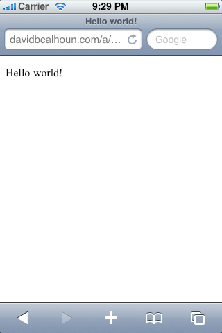
好的!不能在简单了。你检查出来,它所有的桌面浏览器上看起来不错,然后你检查出来您的移动设备。

Hello World on the iPhone
天啊!哪里,我们出问题了吗?显然是没有放大阅读的文本。
这是在移动网站上的第一课:宽度是你的敌人。这是会在许多无数设备上遇到的宽度问题。
从逻辑上讲,它似乎很有道理:移动Safari在页面的,假设打开的是一个网站,并且会默认宽度是980px,这样,页面根据手机屏幕大小相应缩放,那么里面的内容也跟着缩放了。
Viewport
我们需要做的是告诉浏览器这个网页是为移动优化。这是viewport meta进入视野。
现在,我们调整我们的Hello World,只是有点...
<!doctype html>
<html>
<head>
    <title>Hello world!</title>

    <meta name="viewport" content="width=device-width"/>
</head>

<body>

<p>Hello world!</p>

</body>
</html>
正常了
好多了!通过设置视口的宽度等于“设备宽度”,我们基本上告诉它的设备宽度是320px,而不是默认980px,它猜中。如果我们设置宽度= 320将iPhone和其他一些智能手机上实现了相同的结果,但并不是所有的手机都有这个确切的宽度,所以最好简单地设置设备的宽度,并让手机浏览器弄清楚。
很多只智能手机都支持viewport metatag , iPhone , Android , webOS (Palm) ,Internet Explorer Mobile, Opera Mini , Opera Mobile.
More fun with the viewport tag
In addition to solving our biggest concern with the width of the content, the viewport tag has more options to play with:
| Property |
Description |
| width |
Width of the viewport in pixels (or device-width). If width isn’t set, it defaults to a desktop size (980px on mobile Safari). |
| height |
Height of the viewport in pixels (or device-height). Generally you don’t need to worry about setting this property. |
| initial-scale |
(0 to 10.0) Multiplier that sets the scale of the page after its initial display. Safe bet: if you need to set it, set it to 1.0. Larger values = zoomed in, smaller values = zoomed out |
| minimum-scale |
(0 to 10.0) The minimum multiplier the user can “zoom out” to. Defaults to 0.25 on mobile Safari. |
| maximum-scale |
(0 to 10.0) The minimum multiplier the user can “zoom in” to. Defaults to 1.6 on mobile Safari. |
| user-scalable |
(yes/no) Whether to allow a user from scaling in/out (zooming in/out). Default to “yes” on mobile Safari.
|
以上文章翻译自:http://davidbcalhoun.com/2010/viewport-metatag
分享到:


相关推荐
"Mobile WEB 页面开发" 移动 Web 开发是指使用 Visual Studio 进行移动 Web 应用程序的开发。移动 Web 窗体页是一种专用的移动 Web 窗体页,它与任何其他 Web 窗体页一样,都是带.aspx 文件扩展名的文本文件。移动 ...
With this hands-on book, veteran mobile and web developer Maximiliano Firtman demonstrates which aspects of your site or app slow down the user’s experience, and what you can do to achieve lightning...
### Head First Mobile Web:关键技术与应用实践 #### 一、移动网络环境的演变与挑战 随着移动设备(如智能手机和平板电脑)的普及,越来越多的用户选择通过这些设备访问互联网。这种趋势使得移动网络的使用量正在...
With users increasingly accessing the web on mobile devices, it’s crucial to make sure your website is built to seamlessly fit this radical change in user behavior. Mobile Web Performance ...
High Performance Mobile Web 英文epub
《Head First Mobile Web》是一本深入浅出介绍移动网络开发的书籍,中文版的发布使得更多的中国读者能够轻松掌握移动Web开发的相关知识。这本书旨在帮助读者理解如何为智能手机和平板电脑等移动设备创建优化的、交互...
移动Web的使用在呈爆炸式增长。很快,人们会更愿意在手机和平板电脑而不是PC机上浏览网页。你的企业需要一种移动策略,不过从哪里开始呢?本书会告诉你如何使用你熟悉的Web技术建立网站和应用,可以在各种任意大小的...
**jQuery Mobile Web API 开发详解** 在Web应用开发中,jQuery Mobile 和 Web API 结合使用可以构建出功能强大且响应式的移动应用。本教程将深入探讨如何利用jQuery Mobile与C#实现的Web API2接口进行交互,展示...
《Head First 深入浅出 Mobile Web》是由[美] Lyza Danger Gardner 和其他作者共同创作,并由林琪等人翻译成中文的书籍。这本书旨在帮助读者深入理解移动Web开发的关键概念和技术,以轻松易懂的方式呈现,适合初学者...
jQuery Mobile Web Development Essentials(3rd) 英文无水印原版pdf 第3版 pdf所有页面使用FoxitReader、PDF-XChangeViewer、SumatraPDF和Firefox测试都可以打开 本资源转载自网络,如有侵权,请联系上传者或...
### ASP.NET Mobile Controls 开发 Mobile Web 应用 #### 知识点概述 - **ASP.NET Mobile Controls**:这是微软为开发移动Web应用程序提供的一套工具包,它包含了一系列控件,这些控件专为移动设备优化,可以适应...
《Head First之Mobile Web》是一本专为初学者设计的移动网页开发教程,以其独特的图文并茂的教学方式,深入浅出地介绍了移动互联网世界的各个方面。这本书涵盖了从基础概念到实践应用的所有关键知识点,旨在帮助读者...
本篇文章将详细探讨如何利用ASP.NET技术进行MobileWeb应用的开发。 一、理解MobileWeb应用与ASP.NET MobileWeb应用是专门为移动设备设计的网页应用,它们通常需要适配不同屏幕尺寸、操作系统和网络环境。ASP.NET...
《Head First Mobile Web》是一本专注于移动Web开发领域的图书,它详细介绍了如何创建能在多种设备和浏览器上运行的移动网站。本书在2011年12月出版,以PDF格式呈现给读者,提供了从基础到高级的移动Web开发技术介绍...
### 关于《掌握移动Web应用开发:使用jQuery Mobile》 #### 标题解析 - **标题:“Master Mobile Web Apps with jQuery Mobile”** - **核心概念**:此书旨在教授读者如何利用jQuery Mobile这一框架来开发高质量的...
Today, mobile is a must for every company, but how you reach users will determinate success or ... The Mobile Web World Chapter 2. Where to measure performance Chapter 3. Optimizing for the first visit
《Head First Mobile Web》是一本专门探讨移动网络开发的书籍,中文版的出现使得更多中国读者能够轻松理解和学习这一领域的知识。这本书以易懂、生动的方式介绍了如何为智能手机和平板电脑等移动设备创建优化的网页...
### 如何使用ASP.NET Mobile Controls开发Mobile Web应用 在探讨如何使用ASP.NET Mobile Controls来构建高效、用户友好的移动Web应用程序之前,我们首先需要了解一些基本概念和技术背景。 #### ASP.NET Mobile ...
**Windows Mobile WebCrawler 使用详解** Windows Mobile WebCrawler 是一款专为运行在Windows Mobile操作系统上的设备设计的网络爬虫工具。它允许用户抓取指定网站的所有链接,并将抓取到的信息整理展示在一个表格...