
</script>")
 代码
代码
<!DOCTYPE html PUBLIC "-//W3C//DTD XHTML 1.0 Transitional//EN" "http://www.w3.org/TR/xhtml1/DTD/xhtml1-transitional.dtd">
<html xmlns="http://www.w3.org/1999/xhtml">
<head>
<title>无标题页</title>
<link href="StyleSheet.css" rel="stylesheet" type="text/css" />
</head>
<body>
<div class="box">
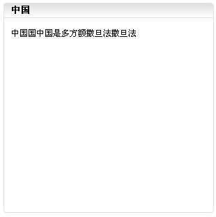
<div class="box_title"><h4>中国</h4></div>
<div class="box_ct">
中国国中国是多方额撒旦法撒旦法
</div>
</div>
</body>
</html>
<html xmlns="http://www.w3.org/1999/xhtml">
<head>
<title>无标题页</title>
<link href="StyleSheet.css" rel="stylesheet" type="text/css" />
</head>
<body>
<div class="box">
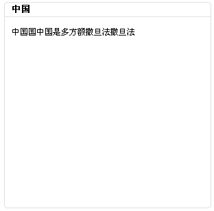
<div class="box_title"><h4>中国</h4></div>
<div class="box_ct">
中国国中国是多方额撒旦法撒旦法
</div>
</div>
</body>
</html>
css:
 代码
代码
/*reset style*/
body,div,from,p,ul,ol,dl,h4,h2,h3{margin:0;padding:0;}
body{font:12px "宋体","Arial";}
img{border:0;}
ul,ol,li{list-style:none;}
h4{ font-size:13px;font-weight:bold;}
.tl{ text-align:left;}
.tc{ text-align:center;}
.tr{ text-align:right;}
.dis{display:block;}
.undis{display:none;}
/*box style*/
.box
{
width:300px;
height:300px;
margin:10px auto auto 10px;
border:1px #dfdfdf solid;
/*border-radius*/
-moz-border-radius:5px;/*fox 支持-radius-topleft等*/
-khtml-border-radius:5px;/*chrome 不支持-radius-topleft等*/
-webkit-border-radius:5px;/*safrai3.1*/
border-radius:5px;/*opera*/
background: -webkit-gradient(linear,0 0, 0 20, from(#dfdfdf), to(#fff)); /*Webkit引擎的浏览器如chrome*/
background:-moz-linear-gradient(top,#dfdfdf, #ffffff 20px); /*fox*/
}
.box_title
{
height:20px;
line-height:20px;
vertical-align:middle;
border-bottom:1px #dfdfdf solid;
filter:progid:DXImageTransform.Microsoft.gradient(startColorstr="#dfdfdf", endColorstr="#ffffff"); /* IE6,IE7 */
-ms-filter:"progid:DXImageTransform.Microsoft.gradient(startColorstr="#dfdfdf", endColorstr="#ffffff")"; /* IE8 */
}
.box_title h4{margin-left:10px;}
.box_ct{padding:10px;line-height:24px;}
不同浏览器的效果:
chrome,fox,safari最新 效果如下:
opera:
ie6,ie7,ie8

转载无需注明出处,多多交流 ,欢迎访问我的博客:http://www.cnblogs.com/niuniu
Tag标签: css3,-border-radius,背景渐变,圆角


相关推荐
corner table sample share for second develop
for fast develoption in the next tern.
JAVA WEB 开发 table 圆角效果。美观大方 下载后直接打开 即可看到效果
table 圆角 html5 css3
用css控制的无图片圆角table div#nifty{ margin: 0 10%;background: #9BD1FA} p {padding:10px}
iOS开发
elementUI给table表头行设置背景颜色样式
用<TABLE>语句来实现圆角表格可以省去制作圆角图片之苦!
1.样式一 圆角表格代码如下: <TABLE style="TABLE-LAYOUT: fixed" height=28 cellSpacing=0 cellPadding=0 width="45%" border=0> <TBODY>
HTML Table 漂亮的CSS 包含了格式各样的CSS,代码非常独立,肯定能够让你用到的。
Android仿IOS的圆角设置界面 直接可用 单选多选等ATable Demo iOS风格设置
仿IOS的圆角设置界面。直接可用,单选多选等ATable_Demo(iOS风格设置).7z
仿IOS的圆角设置界面。直接可用,单选多选等ATable_Demo(iOS风格设置) [注:本内容来自网络,在此分享仅为帮助有需要的网友,如果侵犯了您的权利,麻烦联系我,我会第一时间删除,谢谢您。]
<TABLE fixed" height=28 cellSpacing=0 cellPadding=0 width="100%" border=0> <TR height=3 width="100%"> <TD> <TABLE fixed" height=3 cellSpacing=0 cellPadding=0 width="100%" border=0> ...
Android高级应用源码-仿IOS的圆角设置界面。直接可用,单选多选等ATable_Demo(iOS风格设置).zip
源码参考,欢迎下载
圆角问题 ,很久前是很麻烦的事情,用过图片等等,现在好了,很简单就可以为div table 加上个圆角
免责声明:资料部分来源于合法的互联网渠道收集和整理,部分自己学习积累成果,供大家学习参考与交流。收取的费用仅用于收集和整理资料耗费时间的酬劳。 本人尊重原创作者或出版方,资料版权归原作者或出版方所有,...
纯CSS3实现一款漂亮的表格效果,具有圆角、渐变、多背景色的特点,最初是在国外网站发现的,自己模拟出来了,不兼容IE8,在IE9/火狐/Chrome以及Safari下完美表现,具体效果请参见演示截图。
实现圆角的加以方法,其他特效