- 浏览: 2110388 次
- 性别:

- 来自: 上海
-

文章分类
- 全部博客 (1878)
- [网站分类]ASP.NET (141)
- [网站分类]C# (80)
- [随笔分类]NET知识库 (80)
- [随笔分类]摘抄文字[非技术] (3)
- [随笔分类]养生保健 (4)
- [网站分类]读书区 (16)
- [随笔分类]赚钱 (7)
- [网站分类].NET新手区 (233)
- [随笔分类]网站 (75)
- [网站分类]企业信息化其他 (4)
- [网站分类]首页候选区 (34)
- [网站分类]转载区 (12)
- [网站分类]SQL Server (16)
- [网站分类]程序人生 (7)
- [网站分类]WinForm (2)
- [随笔分类]错误集 (12)
- [网站分类]JavaScript (3)
- [随笔分类]小说九鼎记 (69)
- [随笔分类]技术文章 (15)
- [网站分类]求职面试 (3)
- [网站分类]其他技术区 (6)
- [网站分类]非技术区 (10)
- [发布至博客园首页] (5)
- [网站分类]jQuery (6)
- [网站分类].NET精华区 (6)
- [网站分类]Html/Css (10)
- [随笔分类]加速及SEO (10)
- [网站分类]Google开发 (4)
- [随笔分类]旅游备注 (2)
- [网站分类]架构设计 (3)
- [网站分类]Linux (23)
- [随笔分类]重要注册 (3)
- [随笔分类]Linux+PHP (10)
- [网站分类]PHP (11)
- [网站分类]VS2010 (2)
- [网站分类]CLR (1)
- [网站分类]C++ (1)
- [网站分类]ASP.NET MVC (2)
- [网站分类]项目与团队管理 (1)
- [随笔分类]个人总结 (1)
- [随笔分类]问题集 (3)
- [网站分类]代码与软件发布 (1)
- [网站分类]Android开发 (1)
- [网站分类]MySQL (1)
- [网站分类]开源研究 (6)
- ddd (0)
- 好久没写blog了 (0)
- sqlserver (2)
最新评论
-
JamesLiuX:
博主,能组个队么,我是Freelancer新手。
Freelancer.com(原GAF – GetAFreelancer)帐户里的钱如何取出? -
yw10260609:
我认为在混淆前,最好把相关代码备份一下比较好,不然项目完成后, ...
DotFuscator 小记 -
日月葬花魂:
大哥 能 加我个QQ 交流一下嘛 ?51264722 我Q ...
web应用程序和Web网站区别 -
iaimg:
我想问下嵌入delphi写的程序总是出现窗体后面感觉有个主窗体 ...
C#自定义控件:WinForm将其它应用程序窗体嵌入自己内部 -
iaimg:
代码地址下不了啊!
C#自定义控件:WinForm将其它应用程序窗体嵌入自己内部
from psd to html ,building a set of website designs step by step
From PSD to HTML, Building a Set of Website Designs Step by Step
Collis Ta'eed on Jun 19th 2008 with 371 comments
Tutorial Details
- Programs: HTML Editor, Photoshop
- Difficulty: Intermediate - Advanced
- Completion Time: 3-6 hours
Today I’m going to take you through my entire process of getting from Photoshop to completed HTML. We’re going to build out a set of 4 PSD mockups of a website that eventually will become a WordPress theme. It’s a massive tutorial, so if you’re going to follow through to the end, make sure you have a few hours to spare!


Demos
If you’re like me, you like to see the end before beginning. You can see the final four HTML files by following these links:
Download the Files
Additionally you can download the full HTML/CSS/Image source files here.
What We’re Building
As you may or may not know, I’ve (very slowly) writing a book on WordPress theming. What we’re building is actually the HTML that I’m using in the book to build the main example themes. The final set of themes is called Creatif. You can see the 4 mockups shown in screenshots below (click to get the larger versions).
You can get the full layered PSD files *and* a tutorial on designing them up from our PSDTUTS Plus membership – but it will cost you $9 a month to access. If you don’t wish to join though, don’t worry because you can follow today’s tutorial completely just using the JPG screenshots below.


Part 1 - Building the Framework and First Page
Unlike previous Site Builds this tutorial is covering a decent sized template. So we’re going to take this in stages. First we’ll do the framework, then the first page, then alternate pages, then finally an alternate colour scheme.
Step 1 - Getting Ready
So first of all we boot up our code editor of choice. I actually use Dreamweaver most of the time (and Textmate sometimes). I find it has some pretty decent code tools and a few features that I’m really used to (in particular a powerful Find+Replace and a quick <img> hook up). If you do use Dreamweaver, I recommend setting up a "Site".
In any case the first things to do are create a directory structure and get ready to build. I usually have an /images/ directory and a /scripts/ directory, and then plonk all my CSS and HTML in the root.

Step 2 - Quick Early Layout
The first thing we’ll do is a quick overall layout in HTML with some barebones CSS just to make sure we’ve got a solid foundation. We can also check it in the major browsers (IE7, IE6, Firefox, Safari) just to make sure we’re on a solid footing. There is nothing worse than coming back all the way to the beginning to fix browser compatibility issues. It’s much better to do it as you go.
So we’re building the first mockup, we can see a few things:
- The design is centred. That immediately tells us we have to wrap it in a container and then centre that container.
- Essentially the design is a series of horizontal blocks. Sometimes the blocks have two columns, sometimes one. So we can do it as a series of <div>’s. This is good because we can then mix and match elements into different pages as you’ll see later.
- We have a footer which is a different colour. This means the background needs to be that colour, in case the users browser stretches. So the footer will need to sit in a different container to the main stuff.
So here’s a HTML layout:
view plaincopy to clipboardprint?
- <!DOCTYPE html PUBLIC "-//W3C//DTD XHTML 1.0 Strict//EN" "http://www.w3.org/TR/xhtml1/DTD/xhtml1-strict.dtd">
- <html xmlns="http://www.w3.org/1999/xhtml">
- <head>
- <meta http-equiv="Content-Type" content="text/html; charset=UTF-8" />
- <title>Creatif</title>
- <link href="style.css" rel="stylesheet" type="text/css" />
- </head>
- <body>
- <div id="main">
- <div class="container">
- <div id="header">
- Logo / Menu
- </div>
- <div id="block_feature">
- Featured Content
- </div>
- <div id="block_content">
- Content
- </div>
- </div>
- </div>
- <div id="footer">
- <div class="container">
- Footer Stuff Goes in Here
- </div>
- </div>
- </body>
- </html>
<!DOCTYPE html PUBLIC "-//W3C//DTD XHTML 1.0 Strict//EN" "http://www.w3.org/TR/xhtml1/DTD/xhtml1-strict.dtd">
<html xmlns="http://www.w3.org/1999/xhtml">
<head>
    <meta http-equiv="Content-Type" content="text/html; charset=UTF-8" />
    <title>Creatif</title>
    <link href="style.css" rel="stylesheet" type="text/css" />

</head>

<body>
    <div id="main">

    	<div class="container">

        	<div id="header">

            	Logo / Menu

            </div>

            <div id="block_feature">

            	Featured Content

            </div>

            <div id="block_content">

            	Content

            </div>

        </div>

    </div>

    <div id="footer">

    	<div class="container">

        	Footer Stuff Goes in Here

        </div>

    </div>
</body>
</html>
As you can see there are two segments: the #main area and the #footer area. Inside each we have a <div class="container"> element which will be fixed width and centred. Then inside the main container we just have a sequence of <div>’s. Now let’s add a little CSS as follows:
view plaincopy to clipboardprint?
- body {
- margin:0px; padding:0px;
- background-color:#131211;
- }
- #main {
- background-color:#c4c0be;
- }
- #footer {
- color:white;
- }
- .container {
- width:950px;
- margin:0 auto;
- border:1px solid red;
- }
body {
	margin:0px; padding:0px;
	background-color:#131211;
}

#main {
	background-color:#c4c0be;
}
#footer {
	color:white;
}
.container {
	width:950px;
	margin:0 auto;
	border:1px solid red;
}
So we’re setting the body’s background colour to the dark brown of the footer. Then the #main area has the lighter background. Finally you can see the .container elements have a width of 950px and are centred using margin: auto. I’ve also added a red border just so you can see where the elements are on the page.
You can see the layout here, or view the screenshot below.

Step 3 - Add Some Background Images
So our layout is looking ship shape. With the main elements positioned, it’s just a matter of going through and styling it all up, couldn’t be easier 
The first thing we need are some images. You can make these yourself if you have the layered PSD’s, or just grab the download ZIP and you’ll find some I made earlier!
Here’s a screenshot of me saving the first image – a large background JPG. I’m using this large background image to get that radial gradient highlight, then I’ll use a thin 1px slice to fill out the left and right sides so it extends off.

Similarly we’ll create a background image for the footer to tile along as a border between it and the main area (you can find that image in the ZIP file, it’s called background_footer.jpg). Now we’ll update the CSS file to remove that red border and add our new background images, as follows:
view plaincopy to clipboardprint?
- @charset "UTF-8";
- /* Background-Styles */
- body {
- margin:0px; padding:0px;
- background-color:#131211;
- }
- #main {
- background:#c4c0be url(images/background_light_slice.jpg) repeat-x;
- }
- #main .container {
- background-image:url(images/background_light.jpg);
- background-repeat:no-repeat;
- min-height:400px;
- }
- #footer {
- background-image:url(images/background_footer.jpg);
- background-repeat:repeat-x;
- color:white;
- padding:40px;
- }
- .container {
- width:950px;
- margin:0 auto;
- position:relative;
- }
@charset "UTF-8";
/* Background-Styles */

body {
	margin:0px; padding:0px;
	background-color:#131211;
}
#main {
	background:#c4c0be url(images/background_light_slice.jpg) repeat-x;
}
#main .container {
	background-image:url(images/background_light.jpg);
	background-repeat:no-repeat;
	min-height:400px;
}
#footer {
	background-image:url(images/background_footer.jpg);
	background-repeat:repeat-x;
	color:white;
	padding:40px;
}
.container {
	width:950px;
	margin:0 auto;
  	position:relative;
}
Two things to note:
- There are multiple ways to set a background. In #main I’ve used a single selector which sets three properties – colour, image, image repeat. But you can also set each property individually as I’ve done in #main .container and #footer.
- Notice that because I want to apply the "background_light.jpg" image to the <div class=’container’> which inside #main, but not to the one that is inside #footer, I’ve written #main .container. In other words, apply it only to elements with the class=’container’ that are inside elements with id=’main’.
Step 4 - Testing in Browsers
So far so good. Don’t forget to test in different browsers. Here you can see in IE7 it’s looking fine and dandy!

Step 5 - Making a Transparent Logo
Next I’ve created the logo element. Because later on we’ll be running an alternate colour scheme I’m going to use a transparent background PNG file. You can make these by switching off the background in Photoshop and then going to File > Save for Web and Devices and selecting PNG-24. You should be aware that PNG-24 produces pretty high file sizes. It’s OK for a small image like this, but for larger ones it can be big.
(If anyone knows how to make compressed PNG files, leave a comment, because I’m pretty sure there is a way to do it, I just don’t know how!)
Anyhow you can grab the transparent logo PNG here.

Now we’ll add our logo and also a menu with this HTML:
view plaincopy to clipboardprint?
- <!DOCTYPE html PUBLIC "-//W3C//DTD XHTML 1.0 Strict//EN" "http://www.w3.org/TR/xhtml1/DTD/xhtml1-strict.dtd">
- <html xmlns="http://www.w3.org/1999/xhtml">
- <head>
- <meta http-equiv="Content-Type" content="text/html; charset=UTF-8" />
- <title>Creatif</title>
- <link href="step_2.css" rel="stylesheet" type="text/css" />
- <link rel="shortcut icon" href="images/favicon.ico" />
- </head>
- <body>
- <div id="main">
- <div class="container">
- <div id="header">
- <ul id="menu">
- <li><a href="">Portfolio</a></li>
- <li><a href="">Services</a></li>
- <li><a href="">About</a></li>
- <li><a href="">Testimonials</a></li>
- <li><a href="">Request a Quote</a></li>
- </ul>
- <div id="logo">
- <h1>Creatif</h1>
- <small>A Family of Rockstar WordPress Themes</small>
- </div>
- </div>
- <div id="block_feature">
- Featured Content
- </div>
- <div id="block_content">
- Content
- </div>
- </div>
- </div>
- <div id="footer">
- <div class="container">
- Footer Stuff Goes in Here
- </div>
- </div>
- </body>
- </html>
<!DOCTYPE html PUBLIC "-//W3C//DTD XHTML 1.0 Strict//EN" "http://www.w3.org/TR/xhtml1/DTD/xhtml1-strict.dtd">
<html xmlns="http://www.w3.org/1999/xhtml">
<head>
    <meta http-equiv="Content-Type" content="text/html; charset=UTF-8" />
    <title>Creatif</title>
    <link href="step_2.css" rel="stylesheet" type="text/css" />
    <link rel="shortcut icon" href="images/favicon.ico" />
</head>

<body>
    <div id="main">
    	<div class="container">

        	<div id="header">

            	<ul id="menu">
                	<li><a href="">Portfolio</a></li>
                	<li><a href="">Services</a></li>
                	<li><a href="">About</a></li>
                	<li><a href="">Testimonials</a></li>
                	<li><a href="">Request a Quote</a></li>
                </ul>

            	<div id="logo">
                	<h1>Creatif</h1>
                    <small>A Family of Rockstar WordPress Themes</small>
                </div>

            </div>

            <div id="block_feature">

            	Featured Content

            </div>

            <div id="block_content">

            	Content

            </div>

        </div>
    </div>

    <div id="footer">
    	<div class="container">

        	Footer Stuff Goes in Here

        </div>
    </div>
</body>
</html>
and this extra CSS:
view plaincopy to clipboardprint?
- #header {
- padding-top:20px;
- }
- #logo h1, #logo small {
- margin:0px;
- display:block;
- text-indent:-9999px;
- }
- #logo {
- background-image:url(images/logo.png);
- background-repeat:no-repeat;
- width:194px;
- height:83px;
- }
- ul#menu {
- margin:0px; padding:0px;
- position:absolute;
- rightright:0px;
- }
- ul#menu li {
- display:inline;
- }
#header {
	padding-top:20px;
}
#logo h1, #logo small {
	margin:0px;
	display:block;
	text-indent:-9999px;
}
#logo {
	background-image:url(images/logo.png);
	background-repeat:no-repeat;
	width:194px;
	height:83px;
}
ul#menu {
	margin:0px; padding:0px;
	position:absolute;
	right:0px;
}
ul#menu li {
	display:inline;
}
Some things to note:
- Rather than just placing the logo image in the HTML, we’ve created a <div id="logo"> and inside that placed a <h1> with the title. Then using CSS we’ve made the text vanish and swapped it for the logo image. This has some SEO benefits.
- I used to just set the text to display:hidden, but a kind commenter on a previous tutorial pointed out that this is a bad practice and it’s better to use text-indent. So as you can see I *do* read my comments
- I’ve placed a very quick, unstyled menu using an unordered list. By setting the display property to inline for the <li> elements, the list changes to a horizontal set of elements … yay!
- Finally because our <div class="container"> element has position:relative, we can now use absolute positioning inside and set right:0px for the menu and it will be aligned to the right. This is great for a WordPress theme because as the person creates new pages the menu will extend, and this way it will stay right aligned.
Step 6 - Fixing Transparency in IE6
Now the one problem with transparent PNGs is that our friend Internet Explorer 6 doesn’t support them! Fortunately that’s relatively easily fixed thanks to this article I found – The Easiest Way to Fix PNG for IE6. We just download a script and add this line in our CSS:
view plaincopy to clipboardprint?
- /* Fix up IE6 PNG Support */
- img, #logo { behavior: url(scripts/iepngfix.htc); }
/* Fix up IE6 PNG Support */
img, #logo { behavior: url(scripts/iepngfix.htc); }
Unfortunately for me though my testing copy of IE6 which because I’m on a Mac is through Darwine – doesn’t recognize the fix … So I have no idea if my hack is working
So anyhow at this point I stopped paying attention to IE6 I’m going to have to get me yet another way to view IE6, maybe through parallels.
In any case, here’s a screenshot of what we get in IE6 when transparency is *not* working…

Step 7 - Fixing up the Menu
Now our menu is still looking pretty ugly, so let’s add a few styles to finish it off, as follows:
view plaincopy to clipboardprint?
- ul#menu {
- margin:0px; padding:0px;
- position:absolute;
- rightright:0px;
- }
- ul#menu li {
- display:inline;
- margin-left:12px;
- }
- ul#menu li a {
- text-decoration:none;
- color:#716d6a;
- font-family:Verdana, Arial, Helvetica, sans-serif;
- font-size:10px;
- font-weight:bold;
- text-transform:uppercase;
- }
- ul#menu li a.active, ul#menu li a:hover {
- color:#211e1e;
- }
ul#menu {
	margin:0px; padding:0px;
	position:absolute;
	right:0px;
}
ul#menu li {
	display:inline;
	margin-left:12px;
}
ul#menu li a {
	text-decoration:none;
	color:#716d6a;
	font-family:Verdana, Arial, Helvetica, sans-serif;
	font-size:10px;
	font-weight:bold;
	text-transform:uppercase;
}
ul#menu li a.active, ul#menu li a:hover {
	color:#211e1e;
}
Nothing very exciting here except that we’ve defined an "active" style which is the same as the :hover style (namely it’s a darker shade). That means we can write <a href="" class="active"> and the link will darken. Later in WordPress we’ll make it so that you can tell what page you are on at any given time.

Step 8 - Adding the Featured Portfolio Item Content
Now we have the base of our page laid out, it’s time to start adding the content blocks. As I mentioned earlier we are going to make this site as a series of interchangeable content blocks. The first one is the "Featured Project" block. So let’s add some HTML:
view plaincopy to clipboardprint?
- <div id="block_featured" class="block">
- <span class="block_inside">
- <div class="image_block">
- <img src="images/sample_feature.jpg" />
- </div>
- <div class="text_block">
- <h2>Eden Website Design</h2>
- <small>in <a href="">web design</a> tagged <a href="">corporate</a>, <a href="">web2</a></small>
- <p>And then a short description of the website would go in here. Something saying maybe what awesome skills I used on the project and how happy the client was. </p>
- <br />
- <a href="" class="button">View Project</a>
- </div>
- </span>
- </div>
            <div id="block_featured" class="block">
            	<span class="block_inside">

                	<div class="image_block">
                    	<img src="images/sample_feature.jpg" />
                    </div>
                    <div class="text_block">
                        <h2>Eden Website Design</h2>
                        <small>in <a href="">web design</a> tagged <a href="">corporate</a>, <a href="">web2</a></small>

                        <p>And then a short description of the website would go in here.  Something saying maybe what awesome skills I used on the project and how happy the client was. </p>
                        <br />
                        <a href="" class="button">View Project</a>
                	</div>

                </span>
            </div>
So that code goes below the <div id="header"></div> code from the previous steps. And unstyled it looks like this:

There are two important things to note here:
- You will see that we have a <div class="block"> followed immediately by a <span class="block_inside">. This is because the boxes we are drawing have a double border, first there is a 1px dark grey border, then inside that a 1px white border. So having two elements means we can have a border on each. I don’t know why I used a <span> on the inside, and as you’ll see later on we wind up changing it
- Where we have the View Project button, instead of using an image, we’re going to create a ‘button’ class and then apply it to regular text links. This makes for a very simple, reusable button look and feel.
Step 9 - Adding some Basic Styles
Now we apply some basic styling like this:
view plaincopy to clipboardprint?
- /*
- Block-Styles
- */
- .block {
- border:1px solid #a3a09e;
- background-color:#ffffff;
- margin-bottom:20px;
- }
- .block_inside {
- display:block;
- border:1px solid #ffffff;
- background: #ffffff url(images/background_block_slice.jpg) repeat-x;
- padding:30px;
- overflow:auto;
- }
- .image_block {
- border:1px solid #b5b5b5;
- background-color:#d2d2d2;
- padding:5px;
- float:left;
- }
- .image_block img {
- border:1px solid #b5b5b5;
- }
- .text_block {
- float:left;
- width:430px;
- margin-left:30px;
- }
/*
	Block-Styles
*/

.block {
	border:1px solid #a3a09e;
	background-color:#ffffff;
	margin-bottom:20px;
}
.block_inside {
	display:block;
	border:1px solid #ffffff;
	background: #ffffff url(images/background_block_slice.jpg) repeat-x;
	padding:30px;
	overflow:auto;
}

.image_block {
	border:1px solid #b5b5b5;
	background-color:#d2d2d2;
	padding:5px;
	float:left;
}
.image_block img {
	border:1px solid #b5b5b5;
}
.text_block {
	float:left;
	width:430px;
	margin-left:30px;
}
So as I mentioned above we have the .block class which just sets a border and bottom margin. Then immediately inside we have the .block_inside element which has a white border, thin slice background (to give it that faint gradient), some padding and finally an overflow value.
We have overflow:auto because we are going to have two floated elements inside. I used to use a clearing <div> but someone in my previous comments pointed out that this works just as well and is a lot cleaner!
Then inside we have an .image_block class which gives our image a double border (one on the <div> and one on the <img> itself) and which is floated left with our main .text_block also floated left to form a mini columned layout.
So our layout now looks like this:

Step 10 - Adding Text Styles
Now the text styling is all over the place at the moment. It sort of looked OK in the previous screenshot because Firefox which I was using has defaulted to a Sans-Serif font. But if I’d screenshotted IE you would have seen a Serif’d typeface instead. So we should get the text sorted out now. We’ll add these bits of CSS to our stylesheet:
view plaincopy to clipboardprint?
- body {
- margin:0px; padding:0px;
- background-color:#131211;
- font-family:Arial, Helvetica, sans-serif;
- color:#7f7d78;
- font-size:13px;
- line-height:19px;
- }
- /*
- Text-Styles
- */
- h2 {
- margin:0px 0px 10px 0px;
- font-size:36px;
- font-family:Helvetica, Arial, Sans-serif;
- color:#000000;
- }
- small {
- color:#595856;
- font-weight:bold;
- font-size:11px;
- display:block;
- margin-bottom:15px;
- }
- a {
- color:#007de2;
- text-decoration:none;
- }
- a:hover { text-decoration:underline; }
- p { margin: 0px 0px 15px 0px; }
- a.button {
- background:#32312f url(images/button_bg.jpg) repeat-x;
- padding:5px 10px 5px 10px;
- color: #ffffff;
- text-decoration: none;
- border:1px solid #32312f;
- text-transform:uppercase;
- font-size:9px;
- line-height:25px;
- }
- a.button:hover {
- background:#007de2 url(images/button_bg_o.jpg) repeat-x;
- border-color:#007de2;
- }
body {
	margin:0px; padding:0px;
	background-color:#131211;
	font-family:Arial, Helvetica, sans-serif;
	color:#7f7d78;
	font-size:13px;
	line-height:19px;
}

/*
	Text-Styles
*/

h2 {
	margin:0px 0px 10px 0px;
	font-size:36px;
	font-family:Helvetica, Arial, Sans-serif;
	color:#000000;
}
small {
	color:#595856;
	font-weight:bold;
	font-size:11px;
	display:block;
	margin-bottom:15px;
}
a {
	color:#007de2;
	text-decoration:none;
}
a:hover { text-decoration:underline; }
p { margin: 0px 0px 15px 0px; }

a.button {
	background:#32312f url(images/button_bg.jpg) repeat-x;
	padding:5px 10px 5px 10px;
	color: #ffffff;
	text-decoration: none;
	border:1px solid #32312f;
	text-transform:uppercase;
	font-size:9px;
	line-height:25px;
}
a.button:hover {
	background:#007de2 url(images/button_bg_o.jpg) repeat-x;
	border-color:#007de2;
}
So:
- First I’ve updated the body tag to have a default font, colour, size and line-height.
- Then we’ve created a <h2> style which fixes the margins and sets the font to Helvetica
- We’ve also created a <small> style for subheadings (like what category a post is in etc)
- We’ve created a link style and link:hover style
- We’ve reset the <p> styling so that the margins are fixed from the stupid defaults
- Finally we’ve created that button class. Note that I’ve defined it as "a.button", or in other words all <a> tags with the class = "button". Why didn’t I just make it ".button" ? Well later on there is a good chance that I will make a second button class for <input>’s and it will be slightly different. So this way they won’t accidentally interact.
- In the button class you will see we’ve set some padding, a border, a background image, a hover style and a line-height attribute … wait a line-height attribute? Yes unfortunately this is a fix for IE which otherwise cuts off the button.
Withour extra styling, the page is starting to take shape!

Step 11 - Adding the Ribbon
One of the neat things about this design is the little blue ribbon strips in the right corner. Thanks to a mix of CSS, transparent PNG files and absolute positioning, these are really easy to add. So first we need to make the image. Once again we create an image with a transparent background and save it as PNG-24, here’s the image:

Next we need to place the image in our HTML, we can do it like this:
view plaincopy to clipboardprint?
- <div class="block">
- <img src="images/ribbon_featured.png" class="ribbon"/>
- <span class="block_inside">
- <div class="image_block">
- <img src="images/sample_feature.jpg" />
- </div>
- <div class="text_block">
- <h2>Eden Website Design</h2>
- <small>in <a href="">web design</a> tagged <a href="">corporate</a>, <a href="">web2</a></small>
- <p>And then a short description of the website would go in here. Something saying maybe what awesome skills I used on the project and how happy the client was. </p>
- <br />
- <a href="" class="button">View Project</a>
- </div>
- </span>
- </div>
			<div class="block">
				<img src="images/ribbon_featured.png" class="ribbon"/>
            	<span class="block_inside">

                	<div class="image_block">
                    	<img src="images/sample_feature.jpg" />
                    </div>
                    <div class="text_block">
                        <h2>Eden Website Design</h2>
                        <small>in <a href="">web design</a> tagged <a href="">corporate</a>, <a href="">web2</a></small>

                        <p>And then a short description of the website would go in here.  Something saying maybe what awesome skills I used on the project and how happy the client was. </p>
                        <br />
                        <a href="" class="button">View Project</a>
                	</div>

                </span>
            </div>
So you can see the <img> tag there on the second line. Note I’ve given it a class=”ribbon” and put it inside the .block element, but outside the .block_inside element. That’s because if we do it inside .block_inside it messes up the overflow:auto property we set earlier. Anyhow right now this will just mess up our layout, so let’s add some styling:
view plaincopy to clipboardprint?
- .block {
- border:1px solid #a3a09e;
- background-color:#ffffff;
- margin-bottom:20px;
- position:relative;
- }
- .ribbon {
- position:absolute;
- top:-3px;
- rightright:-3px;
- }
.block {
	border:1px solid #a3a09e;
	background-color:#ffffff;
	margin-bottom:20px;
	position:relative;
}
.ribbon {
	position:absolute;
	top:-3px;
	right:-3px;
}
You can see that we’ve:
- Added a position:relative attribute to the .block element. This is so that we can use absolute positioning inside and have it relative to the .block element (and not the whole page)
- Then we’ve set the image to appear 3px past the right edge and 3px past the top edge.
Easy! Back in the day, we would have had to use some super complicated <table> layout to achieve that same effect. Here’s how it’s looking now:

Step 12 - Creating the Second Block
With the ribbon added, our first block element is complete! Now it’s time to start on the next <div> block. This one will have that text about the theme and the recent projects list. So first we add some HTML:
view plaincopy to clipboardprint?
- <div id="block_portfolio">
- <div id="portfolio_items">
- <div class="mini_portfolio_item">
- <div class="block_inside">
- <img src="images/sample_mini_portfolio.jpg" class="thumbnail" alt="PSDTUTS" />
- <h3>PSDTUTS Theme Design</h3>
- <p>Website design for leading photoshop tutorial site and creation and maintenance of WordPress theme. </p>
- <a href="#" class="button">View Project</a>
- </div>
- </div>
- </div>
- <div id="text_column">
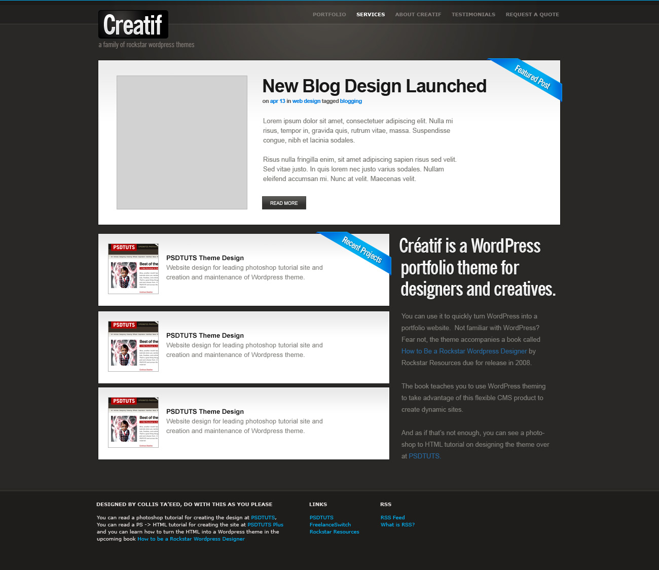
- <h2 id="text_title">Creatif is a WordPress portfolio theme for designers and creatives</h2>
- <p>You can use it to quickly turn WordPress into a portfolio website. Not familiar with WordPress? Fear not, the theme accompanies a book called <a href="#">How to Be a Rockstar WordPress Designer</a> by Rockstar Resources due for release in 2008.</p>
- <p>The book teaches you to use WordPress theming to take advantage of this flexible CMS product to create dynamic sites.</p>
- <p>And as if that’s not enough, you can see a photoshop to HTML tutorial on designing the theme over at <a href="http://psdtuts.com">PSDTUTS</a> and <a href="http://nettuts.com">NETTUTS</a>.</p>
- </div>
- </div>
			<div id="block_portfolio">

            	<div id="portfolio_items">

                	<div class="mini_portfolio_item">
                    	<div class="block_inside">
                            <img src="images/sample_mini_portfolio.jpg" class="thumbnail" alt="PSDTUTS"  />
                            <h3>PSDTUTS Theme Design</h3>
                            <p>Website design for leading photoshop tutorial site and creation and maintenance of WordPress theme. </p>
                            <a href="#" class="button">View Project</a>
                        </div>
                    </div>

                    <div class="mini_portfolio_item">
                    	<div class="block_inside">
                            <img src="images/sample_mini_portfolio.jpg" class="thumbnail" alt="PSDTUTS"  />
                            <h3>PSDTUTS Theme Design</h3>
                            <p>Website design for leading photoshop tutorial site and creation and maintenance of WordPress theme. </p>
                            <a href="#" class="button">View Project</a>
                        </div>
                    </div>

                </div>

                <div id="text_column">
                    <h2 id="text_title">Creatif is a WordPress portfolio theme for designers and creatives</h2>
                    <p>You can use it to quickly turn WordPress into a portfolio website.  Not familiar with WordPress? Fear not, the theme accompanies a book called <a href="#">How to Be a Rockstar WordPress Designer</a> by Rockstar Resources due for release in 2008.</p>
                    <p>The book teaches you to use WordPress theming to take advantage of this flexible CMS product to create dynamic sites.</p>
                  <p>And as if that’s not enough, you can see a photoshop to HTML tutorial on designing the theme over at <a href="http://psdtuts.com">PSDTUTS</a> and <a href="http://nettuts.com">NETTUTS</a>.</p>
			  </div>

            </div>
So that looks like lots of code, but it’s not really. Let’s go through it:
- First we’ve created a container <div id="block_portfolio"> to wrap up the code segment
- Next we’ve got a <div id="portfolio_items"> which contains three identical <div class="mini_portfolio_item">’s. We’ll talk about these in a second.
- Next we have a <div id="text_column"> which is filled with some text and a <h2> heading.
- What we are going to do is float the text column and portfolio items side by side to form two columns of content.
- We’re going to replace that <h2> with a background image.
- And we’ll style up those mini_portfolio_item divs to look nice using a similar double border effect as we did earlier.
Here’s the CSS:
view plaincopy to clipboardprint?
- /*
- Portfolio-Home-Styles
- */
- #block_portfolio {
- overflow:auto;
- margin-bottom:20px;
- }
- #portfolio_items {
- width:615px;
- margin-right:25px;
- float:left;
- }
- #text_column {
- float:rightright;
- width:310px;
- }
- #text_column h2#text_title {
- text-indent:-9999px;
- background-image:url(images/creatif.jpg);
- background-repeat:no-repeat;
- width:310px;
- height:129px;
- }
- .mini_portfolio_item {
- border:1px solid #a3a09e;
- margin-bottom:10px;
- }
- .mini_portfolio_item .block_inside {
- background:none; background-color:#e2dddc;
- padding:25px 30px 15px 30px;
- }
- .mini_portfolio_item .thumbnail { float:left; margin-right:20px; border:1px solid #979390; }
/*
	Portfolio-Home-Styles
*/

#block_portfolio {
	overflow:auto;
	margin-bottom:20px;
}
#portfolio_items {
	width:615px;
	margin-right:25px;
	float:left;

}
#text_column {
	float:right;
	width:310px;
}
#text_column h2#text_title {
	text-indent:-9999px;
	background-image:url(images/creatif.jpg);
	background-repeat:no-repeat;
	width:310px;
	height:129px;
}

.mini_portfolio_item {
	border:1px solid #a3a09e;
	margin-bottom:10px;

}
.mini_portfolio_item .block_inside {
	background:none; background-color:#e2dddc;
	padding:25px 30px 15px 30px;
}
.mini_portfolio_item .thumbnail { float:left; margin-right:20px; border:1px solid #979390; }
OK again, looks like a lot, but it’s not too bad. Let’s go through it step by step:
- First we’ve again used overflow:auto on the main #block_portfolio element. That’s because we again have two floated columns and if we don’t do this, they’ll run over the footer.
- Next we’ve set #portfolio_items to float to the left, have a margin to separate it from the text column and a width of 615px.
- The #text_column is set to float to the right with a width of 310px.
- Inside the text column we’ve again done that trickery with our <h2> tag where we use a massive text-indent to make the text disappear and then instead use a background image.
Next we have three style definitions for the mini_portfolio_item elements as follows:
- First we set a 1px dark border and a margin between them
- Next we redefine the .block_inside styles to suit these elements. Remember .block_inside was defined earlier when we did the Featured Project area. So here we are overriding the background image, changing the background colour and changing the padding.
- Finally we make the thumbnail images float left and have a border.
So all in all it’s looking like this:

Step 13 - Adding a Ribbon.
Now we want to add a "Recent Projects" ribbon to the top most item. To do this we simply slot it in, in the same position in the HTML as previously, like this:
view plaincopy to clipboardprint?
- <div class="mini_portfolio_item">
- <img src="images/ribbon_recent.png" class="ribbon" alt="Recent Projects"/>
- <div class="block_inside">
- <img src="images/sample_mini_portfolio3.jpg" class="thumbnail" alt="AudioJungle" />
- <h3>AudioJungle Site Design</h3>
- <p>Website design for leading photoshop tutorial site and creation and maintenance of WordPress theme. </p>
- <a href="#" class="button">View Project</a>
- </div>
- </div>
					<div class="mini_portfolio_item">
                    	<img src="images/ribbon_recent.png" class="ribbon" alt="Recent Projects"/>
                    	<div class="block_inside">
                            <img src="images/sample_mini_portfolio3.jpg" class="thumbnail" alt="AudioJungle" />
                            <h3>AudioJungle Site Design</h3>
                            <p>Website design for leading photoshop tutorial site and creation and maintenance of WordPress theme. </p>
                            <a href="#" class="button">View Project</a>
                        </div>
                    </div>
Then we add a position:relative attribute to the mini_portfolio_item element like this:
view plaincopy to clipboardprint?
- .mini_portfolio_item {
- border:1px solid #a3a09e;
- margin-bottom:10px;
- position:relative;
- }
.mini_portfolio_item {
	border:1px solid #a3a09e;
	margin-bottom:10px;
	position:relative;
}
But something weird happens… While the right hand side looks correct, the top is getting cut off, as you can see in the screenshot:

The reason is that the element that our mini_portfolio_item is sitting inside is cutting it off. So we check up and see that the mini_portfolio_item’s are all inside a <div id="portfolio_items">. So the solution is pretty easy, we add 3px of padding to the top which is just enough space for our ribbon to show through. Here’s the adjusted CSS:
view plaincopy to clipboardprint?
- #portfolio_items {
- width:615px;
- margin-right:25px;
- float:left;
- padding-top:3px;
- }
#portfolio_items {
	width:615px;
	margin-right:25px;
	float:left;
	padding-top:3px;
}
Step 14 - Finishing off the Portfolio Items
Finally I’ve swapped in a few images and titles so we can see how the page looks with 3 different items instead of the same one repeated. Then I also decided to get rid of the View Project button and just have a text link. This looked a bit cleaner and less busy. So here’s the final portfolio items section (shown in Safari, don’t forget to keep testing in different browsers!):

Step 15 - Adding Footer Content
Now there is just one more section to our page: the footer! Let’s add some text content to it:
view plaincopy to clipboardprint?
- <div id="footer">
- <div class="container">
- <div class="footer_column long">
- <h3>Designed by Collis Ta’eed, do with this as you please</h3>
- <p>You can read a photoshop tutorial for creating the design at <a href="http://psdtuts.com">PSDTUTS</a>, You can read a PS->HTML tutorial for creating the site at <a href="http://nettuts.com">NETTUTS</a> and you can learn how to turn the HTML into a WordPress theme in the upcoming book <a href="http://freelanceswitch.com/book">How to be a Rockstar WordPress Designer</a></p>
- </div>
- <div class="footer_column">
- <h3>More Links</h3>
- <ul>
- <li><a href="http://vectortuts.com">VECTORTUTS</a></li>
- <li><a href="http://activeden.net">FlashDen</a></li>
- <li><a href="http://audiojungle.net">AudioJungle</a></li>
- <li><a href="http://freelanceswitch.com">FreelanceSwitch</a></li>
- <li><a href="http://faveup.com">FaveUp</a></li>
- </ul>
- </div>
- <div class="footer_column">
- <h3>RSS</h3>
- <ul>
- <li><a href="">RSS Feed</a></li>
- <li><a href="">What is RSS?</a></li>
- </ul>
- </div>
- </div>
- </div>
	<div id="footer">
    	<div class="container">

        	<div class="footer_column long">
                <h3>Designed by Collis Ta’eed, do with this as you please</h3>
                <p>You can read a photoshop tutorial for creating the design at <a href="http://psdtuts.com">PSDTUTS</a>, You can read a PS->HTML tutorial for creating the site at <a href="http://nettuts.com">NETTUTS</a> and you can learn how to turn the HTML into a WordPress theme in the upcoming book <a href="http://freelanceswitch.com/book">How to be a Rockstar WordPress Designer</a></p>
			</div>

	        <div class="footer_column">
                <h3>More Links</h3>
				<ul>
                    <li><a href="http://vectortuts.com">VECTORTUTS</a></li>
            		<li><a href="http://activeden.net">FlashDen</a></li>
            		<li><a href="http://audiojungle.net">AudioJungle</a></li>
            		<li><a href="http://freelanceswitch.com">FreelanceSwitch</a></li>
            		<li><a href="http://faveup.com">FaveUp</a></li>
                </ul>
            </div>

            <div class="footer_column">
                <h3>RSS</h3>
				<ul>
                    <li><a href="">RSS Feed</a></li>
            		<li><a href="">What is RSS?</a></li>
                </ul>
            </div>

        </div>
    </div>
A few things to note:
- I’ve created three <div class="footer_column">’s to house the content of the footer, we’ll float these into place in a second.
- Since the first column is a different width I’ve given it a second class called "long". Note that you set two classes like this: class="class1 class2", not like this: class="class1" class="class2" which is invalid markup.
- Inside the columns I’ve used <ul> lists and <h3> tags for the headings. It’s always good to use nice semantic markup, both because it makes it more readable, and because search engines like to see those headings and lists all laid out properly.
Here’s how it’s looking!

Step 16 - Styling the Footer
Styling the footer is a pretty simple job, here’s the code we need:
view plaincopy to clipboardprint?
- /*
- Footer-Styles
- */
- #footer {
- font-family:Verdana, Arial, Helvetica, sans-serif;
- font-size:10px;
- }
- .footer_column {
- float:left;
- width:120px;
- margin-right:30px;
- }
- #footer .long {
- width:610px;
- }
- #footer h3 {
- color:#e2dddc;
- text-transform:uppercase;
- font-size:10px;
- }
- .footer_column ul li, .footer_column ul {
- list-style:none;
- margin:0px;
- padding:0px;
- }
/*
	Footer-Styles
*/

#footer {
	font-family:Verdana, Arial, Helvetica, sans-serif;
	font-size:10px;
}
.footer_column {
	float:left;
	width:120px;
	margin-right:30px;
}
#footer .long {
	width:610px;
}
#footer h3 {
	color:#e2dddc;
	text-transform:uppercase;
	font-size:10px;
}
.footer_column ul li, .footer_column ul {
	list-style:none;
	margin:0px;
	padding:0px;
}
Going through:
- First we set the fonts for the #footer area
- Then we set all the columns to float with a default width of 120px
- We override this width for the .long column. Notice that I’ve set "#footer .long" instead of just ".long". The reason I did this is that "long" is the kind of generic name I might use again later on somewhere else, so it’s a
分享到:


发表评论

相关推荐
Node.js,简称Node,是一个开源且跨平台的JavaScript运行时环境,它允许在浏览器外运行JavaScript代码。Node.js于2009年由Ryan Dahl创立,旨在创建高性能的Web服务器和网络应用程序。它基于Google Chrome的V8 JavaScript引擎,可以在Windows、Linux、Unix、Mac OS X等操作系统上运行。 Node.js的特点之一是事件驱动和非阻塞I/O模型,这使得它非常适合处理大量并发连接,从而在构建实时应用程序如在线游戏、聊天应用以及实时通讯服务时表现卓越。此外,Node.js使用了模块化的架构,通过npm(Node package manager,Node包管理器),社区成员可以共享和复用代码,极大地促进了Node.js生态系统的发展和扩张。 Node.js不仅用于服务器端开发。随着技术的发展,它也被用于构建工具链、开发桌面应用程序、物联网设备等。Node.js能够处理文件系统、操作数据库、处理网络请求等,因此,开发者可以用JavaScript编写全栈应用程序,这一点大大提高了开发效率和便捷性。 在实践中,许多大型企业和组织已经采用Node.js作为其Web应用程序的开发平台,如Netflix、PayPal和Walmart等。它们利用Node.js提高了应用性能,简化了开发流程,并且能更快地响应市场需求。
基础运维技能(下)md格式笔记
Node.js,简称Node,是一个开源且跨平台的JavaScript运行时环境,它允许在浏览器外运行JavaScript代码。Node.js于2009年由Ryan Dahl创立,旨在创建高性能的Web服务器和网络应用程序。它基于Google Chrome的V8 JavaScript引擎,可以在Windows、Linux、Unix、Mac OS X等操作系统上运行。 Node.js的特点之一是事件驱动和非阻塞I/O模型,这使得它非常适合处理大量并发连接,从而在构建实时应用程序如在线游戏、聊天应用以及实时通讯服务时表现卓越。此外,Node.js使用了模块化的架构,通过npm(Node package manager,Node包管理器),社区成员可以共享和复用代码,极大地促进了Node.js生态系统的发展和扩张。 Node.js不仅用于服务器端开发。随着技术的发展,它也被用于构建工具链、开发桌面应用程序、物联网设备等。Node.js能够处理文件系统、操作数据库、处理网络请求等,因此,开发者可以用JavaScript编写全栈应用程序,这一点大大提高了开发效率和便捷性。 在实践中,许多大型企业和组织已经采用Node.js作为其Web应用程序的开发平台,如Netflix、PayPal和Walmart等。它们利用Node.js提高了应用性能,简化了开发流程,并且能更快地响应市场需求。
持续更新
PCL-1.14.1-AllInOne-msvc2022-win64+pdb-msvc2022-win64
PC商城系统源码
Defender Control v2.1(win11 禁用defender服务工具).zip
Node.js,简称Node,是一个开源且跨平台的JavaScript运行时环境,它允许在浏览器外运行JavaScript代码。Node.js于2009年由Ryan Dahl创立,旨在创建高性能的Web服务器和网络应用程序。它基于Google Chrome的V8 JavaScript引擎,可以在Windows、Linux、Unix、Mac OS X等操作系统上运行。 Node.js的特点之一是事件驱动和非阻塞I/O模型,这使得它非常适合处理大量并发连接,从而在构建实时应用程序如在线游戏、聊天应用以及实时通讯服务时表现卓越。此外,Node.js使用了模块化的架构,通过npm(Node package manager,Node包管理器),社区成员可以共享和复用代码,极大地促进了Node.js生态系统的发展和扩张。 Node.js不仅用于服务器端开发。随着技术的发展,它也被用于构建工具链、开发桌面应用程序、物联网设备等。Node.js能够处理文件系统、操作数据库、处理网络请求等,因此,开发者可以用JavaScript编写全栈应用程序,这一点大大提高了开发效率和便捷性。 在实践中,许多大型企业和组织已经采用Node.js作为其Web应用程序的开发平台,如Netflix、PayPal和Walmart等。它们利用Node.js提高了应用性能,简化了开发流程,并且能更快地响应市场需求。
Node.js,简称Node,是一个开源且跨平台的JavaScript运行时环境,它允许在浏览器外运行JavaScript代码。Node.js于2009年由Ryan Dahl创立,旨在创建高性能的Web服务器和网络应用程序。它基于Google Chrome的V8 JavaScript引擎,可以在Windows、Linux、Unix、Mac OS X等操作系统上运行。 Node.js的特点之一是事件驱动和非阻塞I/O模型,这使得它非常适合处理大量并发连接,从而在构建实时应用程序如在线游戏、聊天应用以及实时通讯服务时表现卓越。此外,Node.js使用了模块化的架构,通过npm(Node package manager,Node包管理器),社区成员可以共享和复用代码,极大地促进了Node.js生态系统的发展和扩张。 Node.js不仅用于服务器端开发。随着技术的发展,它也被用于构建工具链、开发桌面应用程序、物联网设备等。Node.js能够处理文件系统、操作数据库、处理网络请求等,因此,开发者可以用JavaScript编写全栈应用程序,这一点大大提高了开发效率和便捷性。 在实践中,许多大型企业和组织已经采用Node.js作为其Web应用程序的开发平台,如Netflix、PayPal和Walmart等。它们利用Node.js提高了应用性能,简化了开发流程,并且能更快地响应市场需求。
Node.js,简称Node,是一个开源且跨平台的JavaScript运行时环境,它允许在浏览器外运行JavaScript代码。Node.js于2009年由Ryan Dahl创立,旨在创建高性能的Web服务器和网络应用程序。它基于Google Chrome的V8 JavaScript引擎,可以在Windows、Linux、Unix、Mac OS X等操作系统上运行。 Node.js的特点之一是事件驱动和非阻塞I/O模型,这使得它非常适合处理大量并发连接,从而在构建实时应用程序如在线游戏、聊天应用以及实时通讯服务时表现卓越。此外,Node.js使用了模块化的架构,通过npm(Node package manager,Node包管理器),社区成员可以共享和复用代码,极大地促进了Node.js生态系统的发展和扩张。 Node.js不仅用于服务器端开发。随着技术的发展,它也被用于构建工具链、开发桌面应用程序、物联网设备等。Node.js能够处理文件系统、操作数据库、处理网络请求等,因此,开发者可以用JavaScript编写全栈应用程序,这一点大大提高了开发效率和便捷性。 在实践中,许多大型企业和组织已经采用Node.js作为其Web应用程序的开发平台,如Netflix、PayPal和Walmart等。它们利用Node.js提高了应用性能,简化了开发流程,并且能更快地响应市场需求。
2024年中国超声非侵入式腐蚀检测传感器行业研究报告
【作品名称】:基于知识图谱的问答系统,结合MetaQA知识图谱,用于解决电影领域的问答问题 【适用人群】:适用于希望学习不同技术领域的小白或进阶学习者。可作为毕设项目、课程设计、大作业、工程实训或初期项目立项。 ## 项目目录结构: 1、train_KGE目录下为训练知识图谱嵌入模型的相关代码,包含以下知识图谱嵌入方法: - RotatE - TransE - DistMult - ComplEx 2、KGQA_system目录下包含了问答系统的实现代码,包含以下几个模块: - 知识图谱嵌入模块 - 问题嵌入模块 - 关系预测模块 - 答案生成模块
Node.js,简称Node,是一个开源且跨平台的JavaScript运行时环境,它允许在浏览器外运行JavaScript代码。Node.js于2009年由Ryan Dahl创立,旨在创建高性能的Web服务器和网络应用程序。它基于Google Chrome的V8 JavaScript引擎,可以在Windows、Linux、Unix、Mac OS X等操作系统上运行。 Node.js的特点之一是事件驱动和非阻塞I/O模型,这使得它非常适合处理大量并发连接,从而在构建实时应用程序如在线游戏、聊天应用以及实时通讯服务时表现卓越。此外,Node.js使用了模块化的架构,通过npm(Node package manager,Node包管理器),社区成员可以共享和复用代码,极大地促进了Node.js生态系统的发展和扩张。 Node.js不仅用于服务器端开发。随着技术的发展,它也被用于构建工具链、开发桌面应用程序、物联网设备等。Node.js能够处理文件系统、操作数据库、处理网络请求等,因此,开发者可以用JavaScript编写全栈应用程序,这一点大大提高了开发效率和便捷性。 在实践中,许多大型企业和组织已经采用Node.js作为其Web应用程序的开发平台,如Netflix、PayPal和Walmart等。它们利用Node.js提高了应用性能,简化了开发流程,并且能更快地响应市场需求。
ISO 3452-3-2013 无损检测渗透检测第3部分:参考试块.pdf
Node.js,简称Node,是一个开源且跨平台的JavaScript运行时环境,它允许在浏览器外运行JavaScript代码。Node.js于2009年由Ryan Dahl创立,旨在创建高性能的Web服务器和网络应用程序。它基于Google Chrome的V8 JavaScript引擎,可以在Windows、Linux、Unix、Mac OS X等操作系统上运行。 Node.js的特点之一是事件驱动和非阻塞I/O模型,这使得它非常适合处理大量并发连接,从而在构建实时应用程序如在线游戏、聊天应用以及实时通讯服务时表现卓越。此外,Node.js使用了模块化的架构,通过npm(Node package manager,Node包管理器),社区成员可以共享和复用代码,极大地促进了Node.js生态系统的发展和扩张。 Node.js不仅用于服务器端开发。随着技术的发展,它也被用于构建工具链、开发桌面应用程序、物联网设备等。Node.js能够处理文件系统、操作数据库、处理网络请求等,因此,开发者可以用JavaScript编写全栈应用程序,这一点大大提高了开发效率和便捷性。 在实践中,许多大型企业和组织已经采用Node.js作为其Web应用程序的开发平台,如Netflix、PayPal和Walmart等。它们利用Node.js提高了应用性能,简化了开发流程,并且能更快地响应市场需求。
目标检测遥感数据集。包括训练集、验证集和测试集共1400张遥感图像及相应标注。已处理为适用yolov5的格式。
Node.js,简称Node,是一个开源且跨平台的JavaScript运行时环境,它允许在浏览器外运行JavaScript代码。Node.js于2009年由Ryan Dahl创立,旨在创建高性能的Web服务器和网络应用程序。它基于Google Chrome的V8 JavaScript引擎,可以在Windows、Linux、Unix、Mac OS X等操作系统上运行。 Node.js的特点之一是事件驱动和非阻塞I/O模型,这使得它非常适合处理大量并发连接,从而在构建实时应用程序如在线游戏、聊天应用以及实时通讯服务时表现卓越。此外,Node.js使用了模块化的架构,通过npm(Node package manager,Node包管理器),社区成员可以共享和复用代码,极大地促进了Node.js生态系统的发展和扩张。 Node.js不仅用于服务器端开发。随着技术的发展,它也被用于构建工具链、开发桌面应用程序、物联网设备等。Node.js能够处理文件系统、操作数据库、处理网络请求等,因此,开发者可以用JavaScript编写全栈应用程序,这一点大大提高了开发效率和便捷性。 在实践中,许多大型企业和组织已经采用Node.js作为其Web应用程序的开发平台,如Netflix、PayPal和Walmart等。它们利用Node.js提高了应用性能,简化了开发流程,并且能更快地响应市场需求。
RNN-LSTM(循环神经网络-长短期记忆网络)是一种在序列数据处理中表现出色的深度学习模型,特别擅长于处理和预测时间序列数据。卷积神经网络(CNN)则在图像识别和处理领域有着广泛的应用,以其局部感受野和权重共享特性而闻名。 "RNN-LSTM卷积神经网络Matlab实现"资源为用户提供了一个在Matlab环境中实现这两种网络的机会。该资源包可能包含以下内容: 1. RNN-LSTM网络的Matlab代码实现,允许用户对序列数据进行深入分析和预测。 2. CNN网络的Matlab代码,适用于图像数据的分类和特征提取任务。 3. 示例数据集和使用教程,帮助用户快速理解并应用这些模型。 4. 定制化接口,使用户能够根据自己的需求调整网络结构和参数。 5. 详细的注释和文档,方便用户学习和理解代码的工作原理。 通过这个资源包,研究人员和开发者可以在Matlab平台上,利用RNN-LSTM和CNN的强大功能,进行复杂的数据分析和模式识别任务。无论是在学术研究还是在工业应用中,该资源都能提供强大的支持。
Node.js,简称Node,是一个开源且跨平台的JavaScript运行时环境,它允许在浏览器外运行JavaScript代码。Node.js于2009年由Ryan Dahl创立,旨在创建高性能的Web服务器和网络应用程序。它基于Google Chrome的V8 JavaScript引擎,可以在Windows、Linux、Unix、Mac OS X等操作系统上运行。 Node.js的特点之一是事件驱动和非阻塞I/O模型,这使得它非常适合处理大量并发连接,从而在构建实时应用程序如在线游戏、聊天应用以及实时通讯服务时表现卓越。此外,Node.js使用了模块化的架构,通过npm(Node package manager,Node包管理器),社区成员可以共享和复用代码,极大地促进了Node.js生态系统的发展和扩张。 Node.js不仅用于服务器端开发。随着技术的发展,它也被用于构建工具链、开发桌面应用程序、物联网设备等。Node.js能够处理文件系统、操作数据库、处理网络请求等,因此,开发者可以用JavaScript编写全栈应用程序,这一点大大提高了开发效率和便捷性。 在实践中,许多大型企业和组织已经采用Node.js作为其Web应用程序的开发平台,如Netflix、PayPal和Walmart等。它们利用Node.js提高了应用性能,简化了开发流程,并且能更快地响应市场需求。