
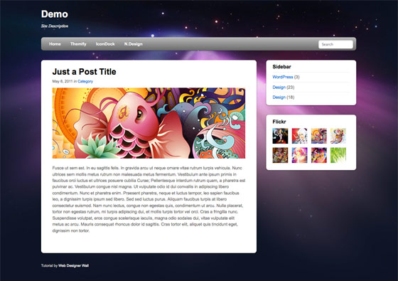
See It in Action First
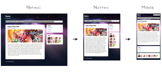
Before you start, check the final demo to see how it looks like. Resize your browser to see how the layout automatically flows based on the width of the viewport (browser viewing area).
More Examples
If you want to see more examples, check out the following WordPress themes that I designed with media queries: Tisa, Elemin, Suco, iTheme2, Funki, Minblr, andWumblr.
Overview
The page's container has a width of 980px which is optimized for any resolution wider than 1024px. Media query is used to check if the viewport is narrower than 980px, then the layout will turn to fluid width instead of fixed width. If the viewport is narrower than 650px, it expands the content container and sidebar to fullwidth to form a single column layout.
HTML Code
I'm not going to go through the details of the HTML code. Below is the main structure of the layout. I have a "pagewrap" container that wraps the "header", "content", "sidebar", and "footer" together.
<div id="pagewrap">

	<header id="header">

		<hgroup>
			<h1 id="site-logo">Demo</h1>
			<h2 id="site-description">Site Description</h2>
		</hgroup>

		<nav>
			<ul id="main-nav">
				<li><a href="#">Home</a></li>
			</ul>
		</nav>

		<form id="searchform">
			<input type="search">
		</form>

	</header>

	<div id="content">

		<article class="post">
			blog post
		</article>

	</div>

	<aside id="sidebar">

		<section class="widget">
			 widget
		</section>

	</aside>

	<footer id="footer">
		footer
	</footer>

</div>
HTML5.js
Note that I use HTML5 markup in my demo. Internet Explorer prior than version 9 doesn't support the new elements introduced in HTML5 such as <header>, <article>, <footer>, <figure>, etc. Including the html5.js Javscript file in the HTML document will enable IE to acknowledge the new elements.
<!--[if lt IE 9]>
	<script src="http://html5shim.googlecode.com/svn/trunk/html5.js"></script>
<![endif]-->
CSS
Reset HTML5 Elements to Block
The following CSS will reset the HTML5 elements (article, aside, figure, header, footer, etc.) to block element.
article, aside, details, figcaption, figure, footer, header, hgroup, menu, nav, section {
    display: block;
}
Main Structure CSS
Again, I'm not going to get into the details. The main "pagewrap" container is 980px wide. Header has a fixed height 160px. The "content" container is 600px wide floated left. The "sidebar" content is 280px wide floated right.
#pagewrap {
	width: 980px;
	margin: 0 auto;
}

#header {
	height: 160px;
}

#content {
	width: 600px;
	float: left;
}

#sidebar {
	width: 280px;
	float: right;
}

#footer {
	clear: both;
}
Step 1 Demo
Here is the design demo. Note that the media queries haven't been implemented yet. Resize the browser window and you should see that the layout is not scalable.
CSS3 Media Query Stuffs
Now here comes the fun part — media queries.
Include Media Queries Javascript
Internet Explorer 8 or older versions doesn't support CSS3 media queries. You can enable it by adding the css3-mediaqueries.js Javascript file.
<!--[if lt IE 9]>
	<script src="http://css3-mediaqueries-js.googlecode.com/svn/trunk/css3-mediaqueries.js"></script>
<![endif]-->
Include Media Queries CSS
Create a new stylesheet for the media queries. Check out my previous tutorial to see how media queries work.
<link href="media-queries.css" rel="stylesheet" type="text/css">
Viewport Smaller Than 980px (Fluid Layout)
For viewport narrower than 980px, the following rules will apply:
- pagewrap = reset width to 95%
- content = reset width to 60%
- sidebar = reset width to 30%
TIPS: use percentage (%) value to make the containers fluid.
@media screen and (max-width: 980px) {

	#pagewrap {
		width: 95%;
	}

	#content {
		width: 60%;
		padding: 3% 4%;
	}

	#sidebar {
		width: 30%;
	}
	#sidebar .widget {
		padding: 8% 7%;
		margin-bottom: 10px;
	}

}
Viewport Smaller Than 650px (One-Column Layout)
Next I have another set of CSS for viewport narrower than 650px:
- header = reset height to auto
- searchform = re-position the searchform to 5px top
- main-nav = reset the position to static
- site-logo = reset the position to static
- site-description = reset the position to static
- content = reset the width to auto (this will make the container to expand fullwidth) and get rid of the float
- sidebar = reset width to 100% and get rid of the float
@media screen and (max-width: 650px) {

	#header {
		height: auto;
	}

	#searchform {
		position: absolute;
		top: 5px;
		right: 0;
	}

	#main-nav {
		position: static;
	}

	#site-logo {
		margin: 15px 100px 5px 0;
		position: static;
	}

	#site-description {
		margin: 0 0 15px;
		position: static;
	}

	#content {
		width: auto;
		float: none;
		margin: 20px 0;
	}

	#sidebar {
		width: 100%;
		float: none;
		margin: 0;
	}

}
Viewport Smaller Than 480px
The following CSS will apply if the viewport is narrower than 480px which is the width of the iPhone screen in landscape orientation.
- html = disable text size adjustment. By default, iPhone enlarges the text size so it reads more comfortably. You can disable the text size adjustment by adding
-webkit-text-size-adjust: none; - main-nav = reset the font size to 90%
@media screen and (max-width: 480px) {

	html {
		-webkit-text-size-adjust: none;
	}

	#main-nav a {
		font-size: 90%;
		padding: 10px 8px;
	}

}
Flexible Images
To make the images flexible, simply add max-width:100% and height:auto. Imagemax-width:100% and height:auto works in IE7, but not in IE8 (yes, another weird IE bug). To fix this, you need to add width:auto\9 for IE8.
img {
	max-width: 100%;
	height: auto;
	width: auto\9; /* ie8 */
}
Flexible Embedded Videos
To make the embedded videos flexible, use the same trick as mentioned above. For unknown reason, max-width:100% (for embed element) doesn't work in Safari. The work around is to use width:100% instead.
.video embed,
.video object,
.video iframe {
	width: 100%;
	height: auto;
}
Initial Scale Meta Tag (iPhone)
By default, iPhone Safari shrinks HTML pages to fit into the iPhone screen. The following meta tag tells iPhone Safari to use the width of the device as the width of the viewport and disable the initial scale.
<meta name="viewport" content="width=device-width; initial-scale=1.0">
Final Demo
View the final demo and resize your browser window to see the media queries in action. Don't forget to check the demo with the iPhone, iPad, Blackberry (newer versions), and Android phones to see the mobile version.
Summaries
-
Media Queries Javascript Fallback:
css3-mediaqueries.js is required to enable media queries for browsers that don't support media queries.<!--[if lt IE 9]> <script src="http://css3-mediaqueries-js.googlecode.com/svn/trunk/css3-mediaqueries.js"></script> <![endif]--> -
CSS Media Queries:
The trick for creating an adaptive design is to use CSS to override the layout structure based on the viewport width.@media screen and (max-width: 560px) { #content { width: auto; float: none; } #sidebar { width: 100%; float: none; } } -
Flexible Images:
Use max-width:100% and height:auto to make the images flexible.img { max-width: 100%; height: auto; width: auto\9; /* ie8 */ } -
Flexible Embedded Videos:
Use width:100% and height:auto to make the embedded videos flexible..video embed, .video object, .video iframe { width: 100%; height: auto; } -
Webkit Text Size Adjust:
Use -webkit-text-size-adjust:none to disable text size adjust on the iPhone.html { -webkit-text-size-adjust: none; } -
Reset iPhone Viewport & Initial Scale:
The following meta tag resets the viewport and inital scale on the iPhone:<meta name="viewport" content="width=device-width; initial-scale=1.0">


相关推荐
This second edition of Responsive Web Design with HTML5 and CSS3 explains all the key approaches necessary to create and maintain a modern responsive design. The changing way in which we access the ...
**响应式网页设计(Responsive Web Design, RWD)** - **定义**:响应式网页设计是一种使网站在不同设备(如桌面、平板、手机等)上都能良好显示的设计方法。它依赖于灵活的布局、图片以及CSS媒体查询。 - **目标...
party tools Executing media queries to benefit responsive designs Understand the basics of responsive workflow and boilerplate frameworks Improve performance of responsive web design Maintain ...
本书《Responsive Web Design with HTML5 and CSS3 [eBook]》主要探讨了响应式网页设计的概念、方法和最佳实践。在当今这个多设备并存的时代,网站设计师和开发者面临着如何让网站在不同尺寸和分辨率的设备上提供...
CSS3的媒体查询(Media Queries)是响应式设计的核心,它们允许你根据设备的特定特性(如宽度、高度、分辨率等)应用不同的样式。这样,你可以为不同屏幕尺寸和设备类型定义不同的布局和样式规则,实现真正的响应式...
媒体查询(Media Queries)是实现响应式布局的关键,允许我们根据设备的特定特征(如视口宽度、设备像素比等)应用不同的样式。例如,可以使用以下媒体查询来定义针对小屏幕设备的样式: ```css @media screen and ...
本书《Beginning Responsive Web Design with HTML5 and CSS3》深入浅出地介绍了响应式网页设计的基础知识和实用技能。通过学习本书,读者不仅能够掌握构建响应式网站的基本方法,还能够了解到如何优化网站性能、...
Responsive Web Design with HTML5 and CSS3 - Second Edition by Ben Frain HTML5 and CSS3 Responsive Web Design Cookbook by Benjamin LaGrone Style and approach This Learning Path course provides a ...
其核心思想是通过CSS3媒体查询(Media Queries)、流体网格(Fluid Grids)和弹性图片(Flexible Images)等技术手段,使得网页在不同尺寸的设备上都能呈现出最佳的显示效果。 - **流体网格**:使用百分比而非固定...
3. **媒体查询(Media Queries)**:CSS3中的媒体查询允许开发者针对不同的设备特性(如屏幕分辨率、宽度、方向等)应用特定的样式。通过这种方式,可以为不同类型的设备提供定制的布局。 4. **断点(Breakpoints)...
例如,CSS3的媒体查询(Media Queries)是实现响应式设计的关键,可以根据设备的物理特性(如宽度、高度、分辨率等)来应用不同的样式,从而实现不同设备上的适配。 该模板以橙色为主色调,橙色是一种活泼且...
CSS3中的媒体查询(Media Queries)是Web设计领域的一个重要技术,它允许内容根据设备的特定特性,如视口宽度、设备像素比等进行适配。这种能力使得开发者能够创建响应式网页设计,确保网站在不同设备上都能提供良好...
Media Queries (for responsive web design) CSS3 Backgrounds and Borders CSS3 Text CSS3 Fonts CSS3 Image Values and Replaced Content (gradients) CSS Multi-column Layout CSS Transforms CSS ...
7. **Responsive Design(响应式设计)**:考虑到罗盘可能在不同尺寸的设备上展示,使用媒体查询(media queries)和百分比单位可以使罗盘适应不同屏幕大小,保持其比例和可读性。 8. **Browser Compatibility...
这个项目利用CSS3的变形(transform)、动画(animation)以及响应式设计(responsive design)技术,实现了信封的展开和折叠,同时还有一个可以填写留言的表单从中抽出来,这在用户体验上是非常创新的。 **CSS3...