
本文引自:https://github.com/baoyongzhang/ActionSheetForAndroid
ActionSheetForAndroid
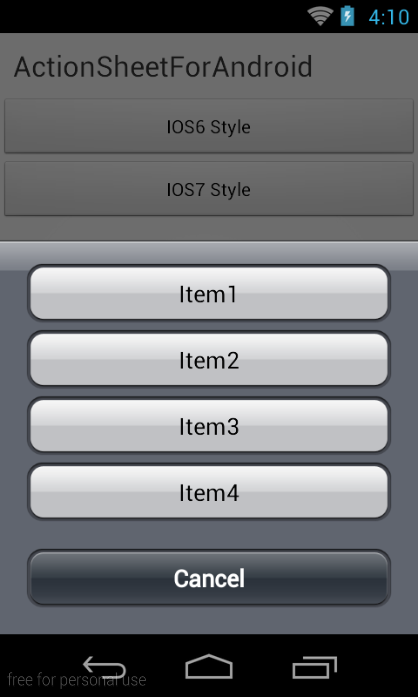
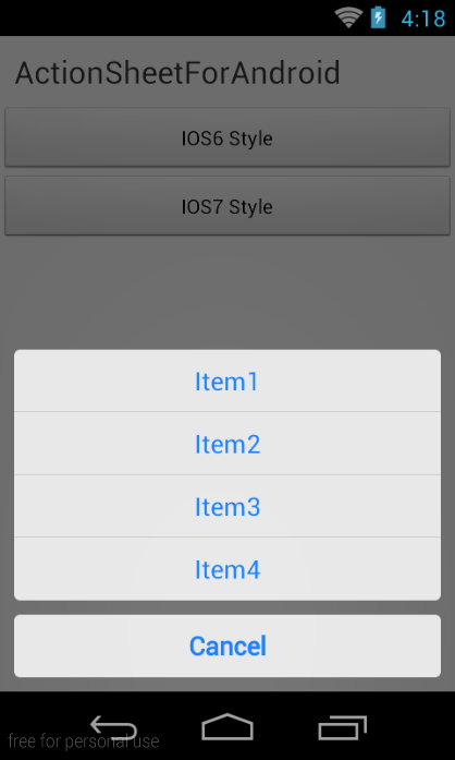
模仿IOS里面的UIActionSheet控件,有iOS6和iOS7两种风格,可以自定义风格,背景图片、按钮图片、文字颜色、间距等。
使用方法
创建一个ActionSheet并显示
ActionSheet.createBuilder(this, getSupportFragmentManager())
                .setCancelButtonTitle("Cancel")
                .setOtherButtonTitles("Item1", "Item2", "Item3", "Item4")
                .setCancelableOnTouchOutside(true)
                .setListener(this).show();
方法说明
-
setCancelButtonTitle()设置取消按钮的标题 -
setOtherButtonTitles()设置条目,String[] -
setCancelableOnTouchOutside()设置点击空白处关闭 -
setListener()设置事件监听器 -
show()返回ActionSheet对象,可以调用ActionSheet对象的dismiss()方法手动关闭
事件监听
实现ActionSheetListener接口
-
onOtherButtonClick()点击某个条目,index是条目的下标 -
onDismiss()关闭事件,isCancel参数表示是否是点击取消按钮、返回键、或者点击空白处(setCancelableOnTouchOutside(true))
    @Override
    public void onOtherButtonClick(ActionSheet actionSheet, int index) {
        Toast.makeText(getApplicationContext(), "click item index = " + index,
                0).show();
    }

    @Override
    public void onDismiss(ActionSheet actionSheet, boolean isCancle) {
        Toast.makeText(getApplicationContext(), "dismissed isCancle = " + isCancle, 0).show();
    }
样式
默认的样式非常丑陋,项目中提供了两种Style,可以配置Theme
<!-- Application theme. -->
    <style name="AppTheme" parent="AppBaseTheme">
        <item name="actionSheetStyle">@style/ActionSheetStyleIOS6</item>
        or
        <item name="actionSheetStyle">@style/ActionSheetStyleIOS7</item>
    </style>
另一个方式就是配置使用这个组件的Activity中设置Theme
@Override
protected void onCreate(Bundle savedInstanceState) {
	super.onCreate(savedInstanceState);

	setTheme(R.style.ActionSheetStyleIOS7);
	setContentView(R.layout.ac_upload_id_photo);
}
还可以自定义样式,自定义一个style即可,可以参考ActionSheetStyleIOS6/ActionSheetStyleIOS7的写法
 <!-- iOS7样式 -->
 <style name="ActionSheetStyleIOS7">
        <item name="actionSheetBackground">@android:color/transparent</item>
        <item name="cancelButtonBackground">@drawable/slt_as_ios7_cancel_bt</item>
        <item name="otherButtonTopBackground">@drawable/slt_as_ios7_other_bt_top</item>
        <item name="otherButtonMiddleBackground">@drawable/slt_as_ios7_other_bt_middle</item>
        <item name="otherButtonBottomBackground">@drawable/slt_as_ios7_other_bt_bottom</item>
        <item name="otherButtonSingleBackground">@drawable/slt_as_ios7_other_bt_single</item>
        <item name="cancelButtonTextColor">#1E82FF</item>
        <item name="otherButtonTextColor">#1E82FF</item>
        <item name="actionSheetPadding">10dp</item>
        <item name="otherButtonSpacing">0dp</item>
        <item name="cancelButtonMarginTop">10dp</item>
        <item name="actionSheetTextSize">12sp</item>
    </style>
Style属性介绍
-
actionSheetBackground背景 -
cancelButtonBackground取消按钮背景 -
otherButtonTopBackground选项顶部按钮背景 -
otherButtonMiddleBackground选项中部按钮背景 -
otherButtonBottomBackground选项底部按钮背景 -
otherButtonSingleBackground选项只有一个的按钮背景 -
cancelButtonTextColor取消按钮的文字颜色 -
otherButtonTextColor选项按钮的文字颜色 -
actionSheetPadding内边距 -
otherButtonSpacing选项按钮的间距 -
cancelButtonMarginTop取消按钮顶部间距 -
actionSheetTextSize选项按钮文字颜色


相关推荐
安卓版ActionSheet 像ios操作表
0.0.0 VScode插件platformIO开发环境的安装[esp32、8266]_̌萌新历险记的博客-CSDN博客.mhtml
五一数学建模
人工智能大模型体验报告3.0 目录 大模型产品测评综述 大模型产品现状与进程 3 .0版本大模型测评规则 大模型厂商整体测评 3.0版本大模型综合指数 3.0版本 测评细分维度指数及评述 测评题目展示 厂商最佳实践案例 厂商优秀案例展示 人工 智能大模型体验报告3.0.pdf (1.39 MB, 需要: RMB 9 元)
使用opencv进行人脸识别和对比-python源码.zip
触屏版自适应手机wap软件网站模板 触屏版自适应手机wap软件网站模板
基于matlab实现的GST模型的红外弱小目标检测代码.rar
LMDI(对数平均迪氏指数法)目前在能源消耗、碳排放等领域应用很多,总体来说并不 是一个很难的方法,但是相应的资料、步骤还是比较少。本人在写论文的时候,通过搜集资 料、研究,找到了stata的实现方法,来自于 Kerry Du老师写的一个模块l dmi,网址为: LMDI: Stata module to compute L ogarithmic Mean Divisia Index (LMDI) Dec omposition (repec.org) 大家可以自己去研究一下。对应的参考 文献就是Ang, B.W., 2005. The LMDI approach t odecomposition analysis: a practical gui de. Energy Policy 33, 867–871. 目前LMDI分解基 本都以这篇文献为参考,论坛里也有,大家可以下载去深入研究一下,总体并不难。 但是 对于LMDI方法的解读以及stata实现的步骤、过程,目前基本没有具体的中文资料 。 本文在写论文的过程中,进行了总结,现上传上来供大家参考,里面包括stata的 程序文件(ado
IEC 60695-11-2-2017 第11-2部分:试验火焰——1kW标称预混合火焰——装置、验证试验安排和指南.pdf
基于matlab实现的拉普拉斯金字塔分解 做毕业设计的可以参考,小波变换以及MGA的初级参考.rar
本文档是课题研究的研究报告内含调研以及源码设计以及结果分析
Node.js,简称Node,是一个开源且跨平台的JavaScript运行时环境,它允许在浏览器外运行JavaScript代码。Node.js于2009年由Ryan Dahl创立,旨在创建高性能的Web服务器和网络应用程序。它基于Google Chrome的V8 JavaScript引擎,可以在Windows、Linux、Unix、Mac OS X等操作系统上运行。 Node.js的特点之一是事件驱动和非阻塞I/O模型,这使得它非常适合处理大量并发连接,从而在构建实时应用程序如在线游戏、聊天应用以及实时通讯服务时表现卓越。此外,Node.js使用了模块化的架构,通过npm(Node package manager,Node包管理器),社区成员可以共享和复用代码,极大地促进了Node.js生态系统的发展和扩张。 Node.js不仅用于服务器端开发。随着技术的发展,它也被用于构建工具链、开发桌面应用程序、物联网设备等。Node.js能够处理文件系统、操作数据库、处理网络请求等,因此,开发者可以用JavaScript编写全栈应用程序,这一点大大提高了开发效率和便捷性。 在实践中,许多大型企业和组织已经采用Node.js作为其Web应用程序的开发平台,如Netflix、PayPal和Walmart等。它们利用Node.js提高了应用性能,简化了开发流程,并且能更快地响应市场需求。
制造企业数字化转型ERP与CRM系统集成定位及场景构建方案.pptx
触屏版自适应手机wap软件网站模板 触屏版自适应手机wap软件网站模板
【课程设计全套资料】基于JAVA的管理系统
IEC 60730-2-13-2017.pdf
机械设计谷物洗涤机sw12非常好的设计图纸100%好用.zip
2000—2022年东中西分区域空间权重矩阵,省级层面,具体包括01矩阵,经济矩 阵,地理矩阵,经济地理矩阵以及经济地理嵌套矩阵,包含原始数据和计算过程,经济地理 权重矩阵采用2000-2022年数据,可以更改研究期间,里面有计算过程,地理距离 是用的欧式距离,如有疑问可与我私聊哈,大家放心下载。
TMCM-0930-TMCL 硬件手册