在看很多开源代码中都使用到了shape,我看代码的时候一般都一带而过了,没有仔细去研究,这几天刚好有空就顺带详细了解一下,在学习的过程中参考了官方文档和网上的示例代码,本文后面会附上测试代码。
方法/步骤
一、在res/drawable文件夹下创建一个名为gradient_box的xml文件:
<?xml version="1.0" encoding="utf-8"?>
<!--
shape drawable xml文件中定义的一个几何图形,定义在res/drawable/目录下,文件名filename称为访问的资源ID
在代码中通过R.drawable.filename进行访问,在xml文件中通过@[package:]drawable/filename进行访问。
-->
<!--
android:shape=["rectangle" | "oval" | "line" | "ring"]
shape的形状,默认为矩形,可以设置为矩形(rectangle)、椭圆形(oval)、线性形状(line)、环形(ring)
下面的属性只有在android:shape="ring时可用:
android:innerRadius 尺寸,内环的半径。
android:innerRadiusRatio 浮点型,以环的宽度比率来表示内环的半径,
例如,如果android:innerRadiusRatio,表示内环半径等于环的宽度除以5,这个值是可以被覆盖的,默认为9.
android:thickness 尺寸,环的厚度
android:thicknessRatio 浮点型,以环的宽度比率来表示环的厚度,例如,如果android:thicknessRatio="2",
那么环的厚度就等于环的宽度除以2。这个值是可以被android:thickness覆盖的,默认值是3.
android:useLevel boolean值,如果当做是LevelListDrawable使用时值为true,否则为false.
-->
<shape
xmlns:android="http://schemas.android.com/apk/res/android"
android:shape="rectangle">
<!--
圆角
android:radius 整型 半径
android:topLeftRadius 整型 左上角半径
android:topRightRadius 整型 右上角半径
android:bottomLeftRadius 整型 左下角半径
android:bottomRightRadius 整型 右下角半径
-->
<corners
android:radius="8dp"
android:topLeftRadius="5dp"
android:topRightRadius="15dp"
android:bottomLeftRadius="20dp"
android:bottomRightRadius="25dp"
/>
<!--
渐变色
android:startColor 颜色值 起始颜色
android:endColor 颜色值 结束颜色
android:centerColor 整型 渐变中间颜色,即开始颜色与结束颜色之间的颜色
android:angle 整型 渐变角度(PS:当angle=0时,渐变色是从左向右。 然后逆时针方向转,当angle=90时为从下往上。angle必须为45的整数倍)
android:type ["linear" | "radial" | "sweep"] 渐变类型(取值:linear、radial、sweep)
linear 线性渐变,这是默认设置
radial 放射性渐变,以开始色为中心。
sweep 扫描线式的渐变。
android:useLevel ["true" | "false"] 如果要使用LevelListDrawable对象,就要设置为true。设置为true无渐变。false有渐变色
android:gradientRadius 整型 渐变色半径.当 android:type="radial" 时才使用。单独使用 android:type="radial"会报错。
android:centerX 整型 渐变中心X点坐标的相对位置
android:centerY 整型 渐变中心Y点坐标的相对位置
-->
<gradient
android:startColor="#FFFF0000"
android:endColor="#80FF00FF"
android:angle="45"
/>
<!--
内边距,即内容与边的距离
android:left 整型 左内边距
android:top 整型 上内边距
android:right 整型 右内边距
android:bottom 整型 下内边距
-->
<padding
android:left="10dp"
android:top="10dp"
android:right="10dp"
android:bottom="10dp"
/>
<!--
size 大小
android:width 整型 宽度
android:height 整型 高度
-->
<size
android:width="600dp"
/>
<!--
内部填充
android:color 颜色值 填充颜色
-->
<solid
android:color="#ffff9d77"
/>
<!--
描边
android:width 整型 描边的宽度
android:color 颜色值 描边的颜色
android:dashWidth 整型 表示描边的样式是虚线的宽度, 值为0时,表示为实线。值大于0则为虚线。
android:dashGap 整型 表示描边为虚线时,虚线之间的间隔 即“ - - - - ”
-->
<stroke
android:width="2dp"
android:color="#dcdcdc"
/>
</shape>
二、在窗口布局文件中将步骤一中创建的文件作为TextView的背景:
<?xml version="1.0" encoding="utf-8"?>
<LinearLayout
xmlns:android="http://schemas.android.com/apk/res/android"
android:layout_width="fill_parent"
android:layout_height="fill_parent">
<TextView
android:layout_width="wrap_content"
android:layout_height="wrap_content"
android:text="ShapeTest"
android:background="@drawable/gradient_box"
android:textSize="24.0dp"
android:textColor="@android:color/black"
/>
</LinearLayout>
========================================================================
shape用于设定形状,可以在selector,layout等里面使用,有6个子标签,各属性如下:
复制代码
<?xml version="1.0" encoding="utf-8"?>
<shape xmlns:android="http://schemas.android.com/apk/res/android" >
<!-- 圆角 -->
<corners
android:radius="9dp"
android:topLeftRadius="2dp"
android:topRightRadius="2dp"
android:bottomLeftRadius="2dp"
android:bottomRightRadius="2dp"/><!-- 设置圆角半径 -->
<!-- 渐变 -->
<gradient
android:startColor="@android:color/white"
android:centerColor="@android:color/black"
android:endColor="@android:color/black"
android:useLevel="true"
android:angle="45"
android:type="radial"
android:centerX="0"
android:centerY="0"
android:gradientRadius="90"/>
<!-- 间隔 -->
<padding
android:left="2dp"
android:top="2dp"
android:right="2dp"
android:bottom="2dp"/><!-- 各方向的间隔 -->
<!-- 大小 -->
<size
android:width="50dp"
android:height="50dp"/><!-- 宽度和高度 -->
<!-- 填充 -->
<solid
android:color="@android:color/white"/><!-- 填充的颜色 -->
<!-- 描边 -->
<stroke
android:width="2dp"
android:color="@android:color/black"
android:dashWidth="1dp"
android:dashGap="2dp"/>
</shape>
复制代码
填充:设置填充的颜色
间隔:设置四个方向上的间隔
大小:设置大小
圆角:同时设置五个属性,则Radius属性无效
android:Radius="20dp" 设置四个角的半径
android:topLeftRadius="20dp" 设置左上角的半径
android:topRightRadius="20dp" 设置右上角的半径
android:bottomLeftRadius="20dp" 设置右下角的半径
android:bottomRightRadius="20dp" 设置左下角的半径
描边:dashWidth和dashGap属性,只要其中一个设置为0dp,则边框为实现边框
android:width="20dp" 设置边边的宽度
android:color="@android:color/black" 设置边边的颜色
android:dashWidth="2dp" 设置虚线的宽度
android:dashGap="20dp" 设置虚线的间隔宽度
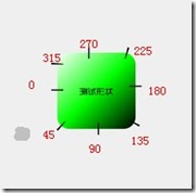
渐变:当设置填充颜色后,无渐变效果。angle的值必须是45的倍数(包括0),仅在type="linear"有效,不然会报错。android:useLevel 这个属性不知道有什么用。
angle对应值的起点如图:
分享到:


相关推荐
Android shape的使用demo,非常简单,适合新手;是这篇博客(http://blog.csdn.net/u024496289/article/details/41924425)的demo代码
主要介绍了android shape的使用及渐变色、分割线、边框、半透明阴影,小编觉得挺不错的,现在分享给大家,也给大家做个参考。一起跟随小编过来看看吧
Android中使用Shape自定义形状
android shape的使用
android 用shape画出来的颜色做背景时,动态的改变它的颜色属性。
android-shape-imageview - 图片圆角、三角、五角、圆形、多角
android shape可以帮助我们实现很多的效果,比如:圆角、虚线边框、部分圆角、颜色的渐变等效果,同时源文件给出了android4.0系统下虚线会变成实线的解决办法。
Android shape属性详解
android 代码实现shape GradientDrawable
Android控件美化之Shape的使用 里面事例非常好的。
Android-shape标签的使用,让我们的界面更加高大上档次
android中shape的使用: http://blog.csdn.net/luohai859/article/details/41038443
Android shape 属性深入用法 我的博客:http://blog.csdn.net/xiaoyuan511
Android Shape源码实例,通过shape可以为为视图设置圆角背景,既可以通过在xml文件中直接为视图设置背景,又可以通过在代码中动态设置。
利用shape优化android UI
Android中shape的使用,细致讲解shape xml的使用规则,已经案例
Android:shape的使用详解(2)http://blog.csdn.net/wangyanguiyiyang/article/details/50060829
探索Android中selector和shape的结合使用
Android 绘制图形可以使用shape也可以使用自定义控件的方式,这里我们说下shape的方式去实现。 在绘制图形之前,我们先来了解下shape的几个属性。 shape /* * 线行 圆形 矩形 / android:shape=line android:shape...